1. 介绍
本节不具有规范性。
transform 属性及其相关属性允许盒模型相对于其布局位置进行任意重新定位(以及旋转、缩放等),而不会破坏页面上任何其他元素的布局。这些位置可以使用 CSS 进行动画或过渡,但只能以相对简单的方式进行:将盒模型从其起始位置沿直线移动到其结束位置。
本规范引入了 offset 缩写属性及其相关的一系列完整属性,它们定义了一个偏移变换:一种将元素上的特定点 (offset-anchor) 对齐到路径 (offset-path 和 offset-distance) 上的偏移位置,并可选地将其旋转以跟随路径方向 (offset-rotate) 的变换。
这允许许多强大的新变换可能性,例如使用极坐标(使用 ray() 函数)而不是 translate() 函数使用的标准矩形坐标进行定位,或者使元素沿定义的路径进行动画处理,从而可以轻松定义复杂而美观的二维空间过渡。

飞机显示在不同的 offset-distance 值处:0%、50% 和 100%。
1.1. 模块交互
本规范定义了可以应用于元素的其他类型的变换(参见 [css-transforms-1])。
如 CSS Transforms 2 § 6 当前变换矩阵中所述,本文档定义的变换在各个变换属性(translate/rotate/scale,在 [css-transforms-2] 中定义)之后,并在 transform 属性(在 [css-transforms-1] 中定义)之前分层。
1.2. 值
本规范遵循 [CSS21] 中的 CSS 属性定义约定。 <basic-shape> 类型在 CSS Shapes Module Level 1 [CSS-SHAPES] 中定义。 <coord-box> 类型在 CSS Box Model Module Level 3 [CSS-BOX-3] 中定义。未在这些规范中定义的值类型在 CSS Values and Units Module Level 3 [CSS3VAL] 中定义。
除了在其定义中列出的特定于属性的值之外,本规范中定义的所有属性还接受 CSS 范围内的关键字,例如 initial 和 inherit 作为其属性值 [CSS3VAL]。为便于阅读,此处未明确重复。
2. 运动路径
2.1. 定义路径:offset-path 属性
| 名称: | offset-path |
|---|---|
| 值: | none | <offset-path> || <coord-box> |
| 初始值: | none |
| 适用于: | 可变换元素 |
| 继承性: | 否 |
| 百分比: | 不适用 |
| 计算值: | 如指定 |
| 规范顺序: | 按语法 |
| 动画类型: | 按计算值 |
| 媒体: | 视觉 |
指定偏移路径,即盒模型定位所依据的几何路径。
<offset-path> = <ray()> | <url> | <basic-shape>
值的含义如下:
- none
-
元素没有偏移变换。
- <offset-path> || <coord-box>
-
元素具有偏移变换, 由某个偏移路径定义。 有关如何计算偏移变换的详细信息,请参见 § 2.7 计算偏移变换。
具有transform 的所有常见效果均适用 (例如创建堆叠上下文等)。 有关详细信息,请参见 CSS Transforms 1 § 3 变换渲染模型。
如果省略 <offset-path>, 则默认为 inset(0 round X), 其中 X 是为此元素建立包含块的元素上的 border-radius 的值。 如果省略 <coord-box>, 则默认为 border-box。
有关每个组件的解释,请参见特定值(如下)。
- <ray()>
-
偏移路径是一条从原点以某个角度延伸的线。 有关详细信息,请参见 § 2.1.1 ray() 函数。
<coord-box> 为射线提供参考框。
- <url>
-
指向 SVG 形状元素的 URL 引用。 偏移路径是所引用元素的等效路径。[SVG2]
如果 URL 未引用形状元素(因为它引用了不同的元素, 或解析为非 SVG 文档, 或根本无法解析, 等等) 则其行为类似于 path("m 0 0")(一个 <basic-shape>)。
<coord-box> 定义了形状元素的视口和用户坐标系, 原点(0,0 点)位于左上角, 单位大小为 1px。
- <basic-shape>
-
偏移路径是 <basic-shape> 函数的等效路径。
对于所有 <basic-shape>, 如果它们接受 at <position> 参数 但该参数被省略, 并且元素通过 offset-position 定义了偏移起始位置, 则它使用指定的偏移起始位置作为该参数。 否则,它将按照每个函数的指定进行默认。
<coord-box> 为 <basic-shape> 提供了 [=<basic-shape>/参考框=]。
- <coord-box>
-
定义 <offset-path> 调整大小所依据的框。
在 CSS 上下文中, 被引用的框 来自为此元素建立包含块的元素。
在 SVG 上下文中, 所有值的行为都类似于 view-box。
测试
- offset-path-composition.html (实时测试) (源码)
- offset-path-interpolation-001.html (实时测试) (源码)
- offset-path-interpolation-002.html (实时测试) (源码)
- offset-path-interpolation-003.html (实时测试) (源码)
- offset-path-interpolation-004.html (实时测试) (源码)
- offset-path-interpolation-005.html (实时测试) (源码)
- offset-path-interpolation-006.html (实时测试) (源码)
- offset-path-interpolation-007.html (实时测试) (源码)
- offset-path-interpolation-008.html (实时测试) (源码)
- offset-path-path-interpolation-001.html (实时测试) (源码)
- offset-path-with-transforms-001.html (实时测试) (源码)
- change-offset-path.html (实时测试) (源码)
- offset-path-coord-box-001.html (实时测试) (源码)
- offset-path-coord-box-002.html (实时测试) (源码)
- offset-path-coord-box-003.html (实时测试) (源码)
- offset-path-coord-box-004.html (实时测试) (源码)
- offset-path-huge-angle-deg-001-crash.html (实时测试) (源码)
- offset-path-huge-angle-grad-001-crash.html (实时测试) (源码)
- offset-path-huge-angle-turn-001-crash.html (实时测试) (源码)
- offset-path-ray-001.html (实时测试) (源码)
- offset-path-ray-002.html (实时测试) (源码)
- offset-path-ray-003.html (实时测试) (源码)
- offset-path-ray-004.html (实时测试) (源码)
- offset-path-ray-005.html (实时测试) (源码)
- offset-path-ray-006.html (实时测试) (源码)
- offset-path-ray-007.html (实时测试) (源码)
- offset-path-ray-008.html (实时测试) (源码)
- offset-path-ray-009.html (实时测试) (源码)
- offset-path-ray-010.html (实时测试) (源码)
- offset-path-ray-011.html (实时测试) (源码)
- offset-path-ray-012.html (实时测试) (源码)
- offset-path-ray-013.html (实时测试) (源码)
- offset-path-ray-014.html (实时测试) (源码)
- offset-path-ray-015.html (实时测试) (源码)
- offset-path-ray-016.html (实时测试) (源码)
- offset-path-ray-017.html (实时测试) (源码)
- offset-path-ray-018.html (实时测试) (源码)
- offset-path-ray-019.html (实时测试) (源码)
- offset-path-ray-020.html (实时测试) (源码)
- offset-path-ray-021.html (实时测试) (源码)
- offset-path-ray-022.html (实时测试) (源码)
- offset-path-ray-contain-001.html (实时测试) (源码)
- offset-path-ray-contain-002.html (实时测试) (源码)
- offset-path-ray-contain-003.html (实时测试) (源码)
- offset-path-ray-contain-004.html (实时测试) (源码)
- offset-path-ray-contain-005.html (实时测试) (源码)
- offset-path-shape-circle-001.html (实时测试) (源码)
- offset-path-shape-circle-002.html (实时测试) (源码)
- offset-path-shape-circle-003.html (实时测试) (源码)
- offset-path-shape-circle-004.html (实时测试) (源码)
- offset-path-shape-circle-005.html (实时测试) (源码)
- offset-path-shape-circle-006.html (实时测试) (源码)
- offset-path-shape-circle-007.html (实时测试) (源码)
- offset-path-shape-circle-008.html (实时测试) (源码)
- offset-path-shape-ellipse-001.html (实时测试) (源码)
- offset-path-shape-ellipse-002.html (实时测试) (源码)
- offset-path-shape-ellipse-003.html (实时测试) (源码)
- offset-path-shape-ellipse-004.html (实时测试) (源码)
- offset-path-shape-ellipse-005.html (实时测试) (源码)
- offset-path-shape-ellipse-006.html (实时测试) (源码)
- offset-path-shape-ellipse-007.html (实时测试) (源码)
- offset-path-shape-inset-001.html (实时测试) (源码)
- offset-path-shape-inset-002.html (实时测试) (源码)
- offset-path-shape-polygon-001.html (实时测试) (源码)
- offset-path-shape-polygon-002.html (实时测试) (源码)
- offset-path-shape-polygon-003.html (实时测试) (源码)
- offset-path-shape-rect-001.html (实时测试) (源码)
- offset-path-shape-rect-002.html (实时测试) (源码)
- offset-path-shape-rect-003.html (实时测试) (源码)
- offset-path-shape-shape-001.html (实时测试) (源码)
- offset-path-shape-shape-002.html (实时测试) (源码)
- offset-path-shape-shape-003.html (实时测试) (源码)
- offset-path-shape-xywh-001.html (实时测试) (源码)
- offset-path-shape-xywh-002.html (实时测试) (源码)
- offset-path-shape-xywh-003.html (实时测试) (源码)
- offset-path-string-001.html (实时测试) (源码)
- offset-path-string-002.html (实时测试) (源码)
- offset-path-string-003.html (实时测试) (源码)
- offset-path-url-001.html (实时测试) (源码)
- offset-path-url-002.html (实时测试) (源码)
- offset-path-url-003.html (实时测试) (源码)
- offset-path-url-004.html (实时测试) (源码)
- offset-path-url-005.html (实时测试) (源码)
- offset-path-url-006.html (实时测试) (源码)
- offset-path-url-007.html (实时测试) (源码)
- offset-path-url-008.html (实时测试) (源码)
- offset-path-url-009.html (实时测试) (源码)
- offset-path-url-010.html (实时测试) (源码)
- offset-path-url-011.html (实时测试) (源码)
- offset-path-url-crash.html (实时测试) (源码)
- offset-path-computed.html (实时测试) (源码)
- offset-path-parsing-invalid.html (实时测试) (源码)
- offset-path-parsing-valid.html (实时测试) (源码)
- offset-path-shape-computed.html (实时测试) (源码)
- offset-path-shape-parsing.html (实时测试) (源码)
2.1.1. ray() 函数
ray() 函数将偏移路径定义为从某个点以某个定义的角度发出的一条直线:
ray() = ray( <angle> && <ray-size>? && contain? && [at <position>]? )

    <ray-size> = closest-side | closest-corner | farthest-side | farthest-corner | sides
其参数为:
- <angle>
-
偏移路径是一个单独的线段, 它从偏移起始位置开始,并沿指定的 <angle> 定义的方向延伸。 (其长度由其他参数确定。) 与渐变函数一样,<angle> 值被解释为方位角, 0deg 指向上方, 正角度表示顺时针旋转。
- <ray-size>
-
指定偏移路径的长度(offset-distance: 0% 和 offset-distance: 100% 点之间的距离), 相对于包含框。
如果未指定 <ray-size>,则默认为 closest-side。
注意:对于 sides, 距离取决于指定的 <angle>; 对于所有其他值, 无论 <angle> 如何,距离都是恒定的。
各个关键字是:
- closest-side
-
从射线的起点 到包含框最近一侧的距离。
- closest-corner
-
从射线的起点 到包含框最近一个角的距离。
- farthest-side
-
从射线的起点 到包含框最远一侧的距离。
- farthest-corner
-
从射线的起点 到包含框最远一个角的距离。
- sides
-
如果射线的起点 在包含框的边界上, 或完全在其边界之外, 则距离为零。
注意:对于 closest-side 和 closest-corner, 如果射线的起点在边/角上, 则该边/角为最近的。 (换句话说,距离为零。)
注意:对于 closest-side 和 farthest-side, 如果射线的起点完全在包含框之外, 则包含框的边缘被认为延伸到无穷远。
- contain
-
偏移路径的长度会减小, 以便即使在 offset-distance: 100% 时,元素也保持在包含框内。
具体来说,路径的长度会减小 元素边框盒宽度的一半或高度的一半, 以较大者为准, 并向下取整到零。
此行为针对特定情况进行了优化——元素的宽度和高度相等或几乎相等; 元素要么通过 border-radius 完全变圆,要么角与其外观无关; ray() 使用 closest-side 定位; 并且 offset-anchor 设置为 center。在这些条件下, 这对于诸如将元素定位在圆形钟面边缘周围的情况很常见, 这确保每个元素 在 offset-distance: 100% 时都相当紧密地贴合钟面的内边缘。
在其他条件下,这将表现得类似,但可能不会给出那么理想的结果。
- at <position>
-
指定射线的原点, 即射线开始的位置 (0% 位置)。 它通过使用 <position> 在盒子的包含框内定位一个 0x0 对象区域来解析。
如果省略,它将使用元素的偏移起始位置, 由 offset-position 给出。
如果元素也没有偏移起始位置, 则其行为类似于 at center。
注意:ray() 目前只能用作偏移路径。 如果它将来扩展到其他用途, 其对 offset-position 的使用将仅限于当它是 偏移路径时, 类似于其他 <basic-shape> 函数。
测试
- ray-angle-interpolation-math-functions.html (实时测试) (源码)
- offset-path-ray-001.html (实时测试) (源码)
- offset-path-ray-002.html (实时测试) (源码)
- offset-path-ray-003.html (实时测试) (源码)
- offset-path-ray-004.html (实时测试) (源码)
- offset-path-ray-005.html (实时测试) (源码)
- offset-path-ray-006.html (实时测试) (源码)
- offset-path-ray-007.html (实时测试) (源码)
- offset-path-ray-008.html (实时测试) (源码)
- offset-path-ray-009.html (实时测试) (源码)
- offset-path-ray-010.html (实时测试) (源码)
- offset-path-ray-011.html (实时测试) (源码)
- offset-path-ray-012.html (实时测试) (源码)
- offset-path-ray-013.html (实时测试) (源码)
- offset-path-ray-014.html (实时测试) (源码)
- offset-path-ray-015.html (实时测试) (源码)
- offset-path-ray-016.html (实时测试) (源码)
- offset-path-ray-017.html (实时测试) (源码)
- offset-path-ray-018.html (实时测试) (源码)
- offset-path-ray-019.html (实时测试) (源码)
- offset-path-ray-020.html (实时测试) (源码)
- offset-path-ray-021.html (实时测试) (源码)
- offset-path-ray-022.html (实时测试) (源码)
- offset-path-ray-contain-001.html (live test) (源码)
- offset-path-ray-contain-002.html (live test) (源码)
- offset-path-ray-contain-003.html (live test) (源码)
- offset-path-ray-contain-004.html (live test) (源码)
- offset-path-ray-contain-005.html (live test) (源码)
< style >
body {
transform-style : preserve-3d ;
width : 200 px ;
height : 200 px ;
}
. box {
width : 50 px ;
height : 50 px ;
offset-position : 50 % 50 % ;
offset-distance : 100 % ;
offset-rotate : 0 deg ;
}
# redBox {
background-color : red ;
offset-path : ray ( 45 deg closest -side );
}
# blueBox {
background-color : blue ;
offset-path : ray ( 180 deg closest -side );
}
</ style >
< body >
< div class = "box" id = "redBox" ></ div >
< div class = "box" id = "blueBox" ></ div >
</ body >
在第二个示例中,为每个盒子的 offset-path 值指定了 contain 以避免溢出。
< style >
body {
transform-style : preserve-3d ;
width : 200 px ;
height : 200 px ;
}
. box {
width : 50 px ;
height : 50 px ;
offset-position : 50 % 50 % ;
offset-distance : 100 % ;
offset-rotate : 0 deg ;
}
# redBox {
background-color : red ;
offset-path : ray ( 45 deg closest -side contain );
}
# blueBox {
background-color : blue ;
offset-path : ray ( 180 deg closest -side contain );
}
</ style >
< body >
< div class = "box" id = "redBox" ></ div >
< div class = "box" id = "blueBox" ></ div >
</ body >
在第三个示例中,路径大小增加以便可以包含盒子。 使用的偏移距离为负。
< style >
body {
transform-style : preserve-3d ;
width : 250 px ;
height : 250 px ;
}
. box {
width : 60 % ;
height : 10 % ;
offset-position : 20 % 20 % ;
offset-distance : 0 % ;
offset-rotate : 0 deg ;
offset-anchor : 200 % -300 % ;
}
# blueBox {
background-color : blue ;
offset-path : ray ( -90 deg closest -side contain );
}
</ style >
< body >
< div class = "box" id = "blueBox" ></ div >
</ body >

在第四个示例中,初始位置在包含块之外。
< style >
# container {
transform-style : preserve-3d ;
width : 200 px ;
height : 200 px ;
}
. box {
width : 20 % ;
height : 20 % ;
offset-position : 140 % 70 % ;
offset-distance : 100 % ;
}
# redBox {
background-color : red ;
offset-path : ray ( -90 deg sides );
}
# blueBox {
background-color : blue ;
offset-path : ray ( 180 deg closest -side );
}
</ style >
< div id = "container" >
< div class = "box" id = "redBox" ></ div >
< div class = "box" id = "blueBox" ></ div >
</ div >

2.1.2. <basic-shape> 定位示例
< style >
body {
width : 323 px ;
height : 131 px ;
margin : 0 px ;
border : 2 px solid black ;
padding : 8 px ;
transform-style : preserve-3d ;
}
. item {
width : 90 px ;
height : 40 px ;
background-color : violet ;
}
# middle {
offset-position : auto ;
offset-path : circle( 60 % ) margin-box ;
offset-distance : 25 % ;
offset-anchor : left top ;
}
</ style >
< body >
< div class = "item" ></ div >
< div class = "item" id = "middle" ></ div >
< div class = "item" ></ div >
</ body >

2.1.3. <coord-box> 定位示例
< style >
body {
width : 500 px ;
height : 300 px ;
border-radius : 80 px ;
border : dashed aqua ;
margin : 0 ;
}
# blueBox {
width : 40 px ;
height : 20 px ;
background-color : blue ;
offset-path : margin-box ;
}
</ style >
< body >
< div id = "blueBox" ></ div >
</ body >

2.2. 路径上的位置:offset-distance 属性
| 名称: | offset-distance |
|---|---|
| 值: | <length-percentage> |
| 初始值: | 0 |
| 适用于: | 可变换元素 |
| 继承: | 否 |
| 百分比: | 相对于偏移路径长度 |
| 计算值: | 计算的 <length-percentage> 值 |
| 规范顺序: | 按语法 |
| 动画类型: | 按计算值 |
| 媒体: | 视觉 |
- <length-percentage>
-
偏移位置是沿元素偏移路径的指定距离的点。 有关如何计算沿路径的距离的详细信息,请参见 § 2.2.1 计算沿路径的计算距离。
百分比相对于偏移路径的总长度。
测试
- offset-distance-composition.html (live test) (源码)
- offset-distance-interpolation.html (live test) (源码)
- offset-distance-interpolation-001.html (live test) (源码)
- offset-distance-001.html (实时测试) (源码)
- offset-distance-002.html (实时测试) (源码)
- offset-distance-003.html (实时测试) (源码)
- offset-distance-004.html (实时测试) (源码)
- offset-distance-005.html (实时测试) (源码)
- offset-distance-006.html (实时测试) (源码)
- offset-distance-007.html (实时测试) (源码)
- offset-distance-008.html (实时测试) (源码)
- offset-distance-009.html (实时测试) (源码)
- offset-distance-computed.html (live test) (源码)
- offset-distance-parsing-invalid.html (live test) (源码)
- offset-distance-parsing-valid.html (live test) (源码)
注意:通过对 offset-distance 进行动画处理, 元素可以轻松地描绘出复杂的路径。
如果元素没有偏移路径, 则此属性不起作用。
2.2.1. 计算沿路径的计算距离
处理沿偏移路径的距离的方式因偏移路径的性质而异:
-
所有基本 CSS 形状都是闭合循环。
-
偏移路径(包括对 SVG 路径的引用)仅当路径列表中的最后一个命令是闭合路径命令(“z”或“Z”)时才是闭合循环,否则它们是未闭合区间。
-
对 SVG 圆形、椭圆、图像、多边形和矩形的引用是闭合循环。
-
对 SVG 直线和折线的引用是未闭合区间。
要确定给定偏移路径和偏移距离的已用偏移距离:
-
设总长度为偏移路径及其所有子路径的总长度。
< style >
. item {
width : 100 px ;
height : 40 px ;
offset-position : 0 % 0 % ;
offset-path : path ( 'm 0 0 h 200 v 150' );
}
# box1 {
background-color : red ;
offset-distance : -280 % ;
}
# box2 {
background-color : green ;
offset-distance : 190 % ;
}
</ style >
< body >
< div class = "item" id = "box1" ></ div >
< div class = "item" id = "box2" ></ div >
</ body >

< style >
. item {
width : 100 px ;
height : 40 px ;
offset-position : 0 % 0 % ;
offset-path : path ( 'm 0 0 h 200 v 150 z' );
}
# box1 {
background-color : red ;
offset-distance : -280 % ;
}
# box2 {
background-color : green ;
offset-distance : 190 % ;
}
</ style >
< body >
< div class = "item" id = "box1" ></ div >
< div class = "item" id = "box2" ></ div >
</ body >

< style >
body {
transform-style : preserve-3d ;
width : 300 px ;
height : 300 px ;
border : dashed gray ;
border-radius : 50 % ;
}
. circleBox {
position : absolute ;
left : 50 % ;
top : 50 % ;
width : 40 px ;
height : 40 px ;
background-color : red ;
border-radius : 50 % ;
}
# circle1 {
offset-path : ray ( 0 deg farthest -side );
offset-distance : 50 % ;
}
# circle2 {
offset-path : ray ( 90 deg farthest -side );
offset-distance : 20 % ;
}
# circle3 {
offset-path : ray ( 225 deg farthest -side );
offset-distance : 100 % ;
}
</ style >
< body >
< div class = "circleBox" id = "circle1" ></ div >
< div class = "circleBox" id = "circle2" ></ div >
< div class = "circleBox" id = "circle3" ></ div >
</ body >
2.3. 路径的起点:offset-position 属性
| 名称: | offset-position |
|---|---|
| 值: | normal | auto | <position> |
| 初始值: | normal |
| 适用于: | 可转换元素 |
| 继承: | 否 |
| 百分比: | 参照包含块的大小 |
| 计算值: | normal 或 auto 关键字,或计算的 <position> |
| 规范顺序: | 按语法 |
| 动画类型: | 按计算值 |
| 媒体: | 视觉 |
指定 <offset-path> 函数在未指定其自身起始位置时使用的偏移起始位置。
值的定义如下:
- normal
-
元素没有偏移起始位置。
- auto
-
偏移起始位置是盒子的左上角。
注意:这是元素自身盒子的左上角, 而不是其包含块的左上角! 这与指定 top left 完全不同。 例如,它旨在允许 path() 相对于 元素自身位置开始。
- <position>
-
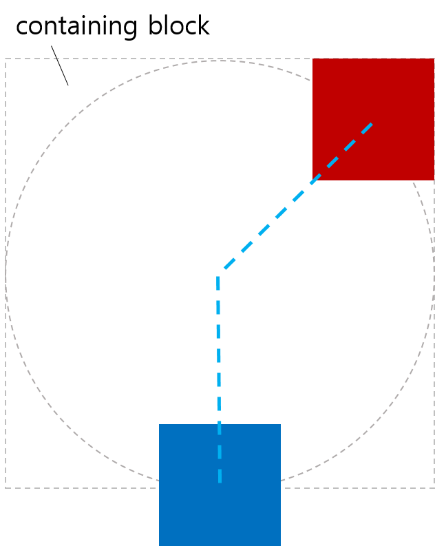
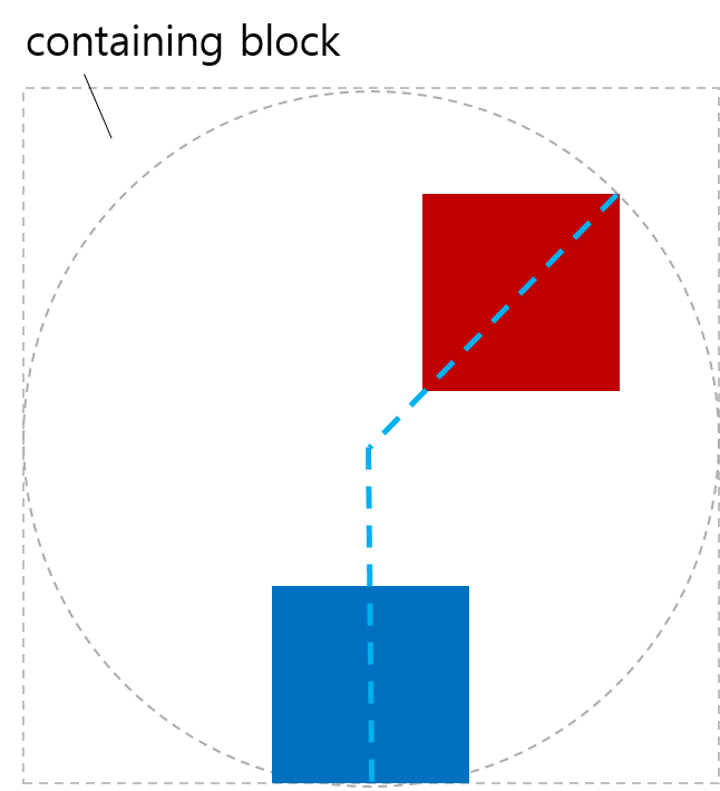
偏移起始位置是使用 <position> 在盒子的包含块内定位 0x0 对象区域的结果。
Tests
< style >
# wrap {
position : relative ;
width : 300 px ;
height : 300 px ;
border : 1 px solid black ;
}
# box {
width : 100 px ;
height : 100 px ;
background-color : green ;
position : absolute ;
top : 100 px ;
left : 80 px ;
offset-position : auto ;
offset-anchor : center ;
offset-path : ray ( 45 deg );
}
</ style >
< body >
< div id = "wrap" >
< div id = "box" ></ div >
</ div >
</ body >
< style >
# wrap {
transform-style : preserve-3d ;
width : 400 px ;
height : 350 px ;
}
. item {
position : absolute ;
left : 200 px ;
top : 0 px ;
offset-position : 200 px 100 px ; /* 平移 0px,100px */
offset-anchor : left top ;
transform-origin : left top ;
width : 130 px ;
height : 80 px ;
border-top-right-radius : 23 px ;
}
# box1 {
background-color : tomato ;
offset-position : auto ;
}
# box2 {
background-color : green ;
}
# box3 {
background-color : navy ;
rotate : 90 deg ; /* 在运动路径变换之前应用 */
}
# box4 {
background-color : gold ;
transform : rotate( 90 deg ); /* 在运动路径变换之后应用 */
}
</ style >
< body >
< div id = "wrap" >
< div class = "item" id = "box1" ></ div >
< div class = "item" id = "box2" ></ div >
< div class = "item" id = "box3" ></ div >
< div class = "item" id = "box4" ></ div >
</ div >
</ body >

< style >
# wrap {
transform-style : preserve-3d ;
width : 500 px ;
height : 250 px ;
line-height : 0 px ;
}
span {
position : static ;
display : inline-block ;
width : 100 px ;
height : 50 px ;
border-top-right-radius : 23 px ;
scale : 2.5 2.5 ; /* 在运动路径变换之前应用 */
offset-position : center ;
transform : scale( 0.4 ); /* 在运动路径变换之后应用 */
}
# box1 {
background-color : tomato ;
}
# box2 {
background-color : green ;
}
# box3 {
background-color : navy ;
}
# box4 {
background-color : gold ;
}
</ style >
< body >
< div id = "wrap" >
< div >
< span id = "box1" ></ span >< span id = "box2" ></ span >
</ div >
< div >
< span id = "box3" ></ span >< span id = "box4" ></ span >
</ div >
</ div >
</ body >

< style >
# wrap {
transform-style : preserve-3d ;
width : 540 px ;
height : 420 px ;
}
. item {
position : absolute ;
width : 90 px ;
height : 70 px ;
border-top-right-radius : 23 px ;
scale : 0.8 0.8 ; /* 在运动路径变换之前应用 */
offset-path : padding-box ;
offset-distance : 50 % ;
offset-rotate : 0 deg ;
offset-anchor : right bottom ;
transform : scale( 1.25 ); /* 在运动路径变换之后应用 */
}
# box1 {
background-color : tomato ;
position : static ;
offset-position : auto ; /* 忽略 */
}
# box2 {
background-color : green ;
right : 0 px ;
top : 0 px ;
offset-position : 23 % 45 % ; /* 忽略 */
}
# box3 {
background-color : navy ;
left : 0 px ;
bottom : 0 px ;
offset-position : 34 % 56 px ; /* 忽略 */
}
# box4 {
background-color : gold ;
right : 0 px ;
bottom : 0 px ;
offset-position : 45 px 67 px ; /* 忽略 */
}
</ style >
< body >
< div id = "wrap" >
< div class = "item" id = "box1" ></ div >
< div class = "item" id = "box2" ></ div >
< div class = "item" id = "box3" ></ div >
< div class = "item" id = "box4" ></ div >
</ div >
</ body >

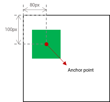
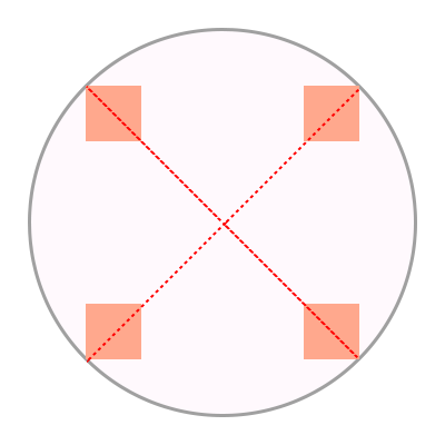
2.4. 元素的锚点:offset-anchor 属性
| 名称: | offset-anchor |
|---|---|
| 值: | auto | <position> |
| 初始值: | auto |
| 适用于: | 可转换元素 |
| 继承: | 否 |
| 百分比: | 相对于元素参考框的宽度和高度 |
| 计算值: | auto 关键字或计算的 <position> |
| 规范顺序: | 按语法 |
| 动画类型: | 按计算值 |
| 媒体: | 视觉 |
值的含义如下:
- auto
-
锚点与 transform-origin 指示的点相同。
具体来说,transform-origin 的计算值被解析为相对于元素参考框的 <position>。
- <position>
-
锚点是解析 <position> 相对于元素参考框的结果。
测试
- offset-anchor-composition.html (live test) (源码)
- offset-anchor-interpolation.html (live test) (源码)
- offset-anchor-transform-box-fill-box-001.html (live test) (源码)
- offset-anchor-transform-box-fill-box-002.html (live test) (源码)
- offset-anchor-transform-box-fill-box-003.html (live test) (源码)
- offset-anchor-computed.html (live test) (源码)
- offset-anchor-parsing-invalid.html (live test) (源码)
- offset-anchor-parsing-valid.html (live test) (源码)
此问题针对哪个盒子进行解析,正在 问题 503 中讨论。

< style >
body {
transform-style : preserve-3d ;
width : 300 px ;
height : 300 px ;
border : 2 px solid gray ;
border-radius : 50 % ;
}
. box {
width : 50 px ;
height : 50 px ;
background-color : orange ;
offset-position : 50 % 50 % ;
offset-distance : 100 % ;
offset-rotate : 0 deg ;
}
# item1 {
offset-path : ray ( 45 deg closest -side );
offset-anchor : right top ;
}
# item2 {
offset-path : ray ( 135 deg closest -side );
offset-anchor : right bottom ;
}
# item3 {
offset-path : ray ( 225 deg closest -side );
offset-anchor : left bottom ;
}
# item4 {
offset-path : ray ( 315 deg closest -side );
offset-anchor : left top ;
}
</ style >
< body >
< div class = "box" id = "item1" ></ div >
< div class = "box" id = "item2" ></ div >
< div class = "box" id = "item3" ></ div >
< div class = "box" id = "item4" ></ div >
</ body >
< style >
body {
width : 500 px ;
height : 500 px ;
}
. box {
background-color : mediumpurple ;
offset-path : none ;
offset-anchor : center ;
}
# item1 {
offset-position : 90 % 20 % ;
width : 60 % ;
height : 20 % ;
}
# item2 {
offset-position : 100 % 100 % ;
width : 30 % ;
height : 10 % ;
}
# item3 {
offset-position : 50 % 100 % ;
width : 20 % ;
height : 60 % ;
}
# item4 {
offset-position : 0 % 100 % ;
width : 30 % ;
height : 90 % ;
}
</ style >
< body >
< div class = "box" id = "item1" ></ div >
< div class = "box" id = "item2" ></ div >
< div class = "box" id = "item3" ></ div >
< div class = "box" id = "item4" ></ div >
</ body >

< style >
body {
width : 500 px ;
height : 500 px ;
}
. box {
background-color : mediumpurple ;
offset-path : none ;
offset-anchor : auto ;
}
# item1 {
offset-position : 90 % 20 % ;
width : 60 % ;
height : 20 % ;
}
# item2 {
offset-position : 100 % 100 % ;
width : 30 % ;
height : 10 % ;
}
# item3 {
offset-position : 50 % 100 % ;
width : 20 % ;
height : 60 % ;
}
# item4 {
offset-position : 0 % 100 % ;
width : 30 % ;
height : 90 % ;
}
</ style >
< body >
< div class = "box" id = "item1" ></ div >
< div class = "box" id = "item2" ></ div >
< div class = "box" id = "item3" ></ div >
< div class = "box" id = "item4" ></ div >
</ body >

2.5. 旋转以匹配路径:offset-rotate 属性
| 名称: | offset-rotate |
|---|---|
| 值: | [ auto | reverse ] || <angle> |
| 初始值: | auto |
| 适用于: | 可变形元素 |
| 继承: | 否 |
| 百分比: | 不适用 |
| 计算值: | 计算的 <angle> 值,可选地以 auto 开头 |
| 规范顺序: | 按语法 |
| 动画类型: | 按计算值 |
| 媒体: | 视觉 |
定义偏移变换的旋转分量, 可能基于偏移路径在偏移位置处的方向。 值的含义如下:
- auto <angle>?
-
偏移变换将具有一个旋转分量, 该分量等于偏移路径在偏移位置处的方向与正 X 轴方向(即指向右侧的线)之间的差值。 有关如何计算此值的详细信息,请参见 SVG 的路径方向。
如果使用 <angle> 指定, 则该角度将添加到旋转分量中。
注意:换句话说, 如果偏移路径向右移动,则 auto 不会添加任何旋转。 当它偏离正右方时, 旋转会匹配。 通过将 auto 与 <angle> 结合使用, 您可以调整“起始”旋转。
- reverse <angle>?
-
与 auto 相同, 但在旋转中额外增加了 180deg。
- <angle>
-
单独指定时, 会向偏移变换添加指定角度的旋转分量。 (也就是说,offset-rotate: 45deg; 类似于 transform: rotate(45deg); 它只是被排序为偏移变换的一部分。)
测试
- offset-rotate-composition.html (live test) (源码)
- offset-rotate-interpolation-math-functions.html (live test) (源码)
- offset-rotate-interpolation.html (live test) (源码)
- offset-rotate-interpolation-001.html (live test) (源码)
- offset-rotate-001.html (实时测试) (源码)
- offset-rotate-002.html (实时测试) (源码)
- offset-rotate-003.html (实时测试) (源码)
- offset-rotate-004.html (实时测试) (源码)
- offset-rotate-005.html (实时测试) (源码)
- offset-rotate-computed.html (live test) (源码)
- offset-rotate-parsing-invalid.html (live test) (源码)
- offset-rotate-parsing-valid.html (live test) (源码)

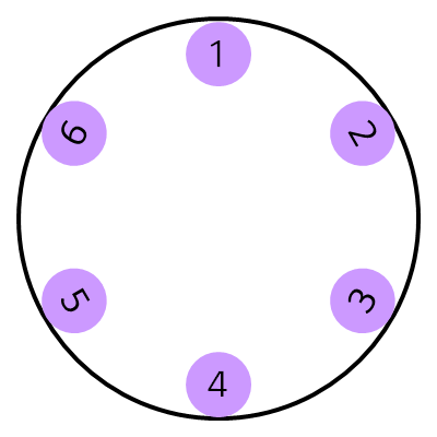
当形状的锚点沿路径放置在不同位置且 offset-rotate 为 0deg 时,形状不旋转。

如果 offset-rotate 属性设置为 auto,并且形状的锚点沿路径放置在不同位置,则形状会根据当前位置的梯度进行旋转,并朝向该位置路径的方向。

在此示例中,offset-rotate 属性设置为 reverse。平面在路径上的每个位置都朝向与路径相反的方向。

最后一个示例将 offset-rotate 属性设置为 -45deg。 形状逆时针旋转 45 度一次,并在路径上的每个位置保持该旋转。

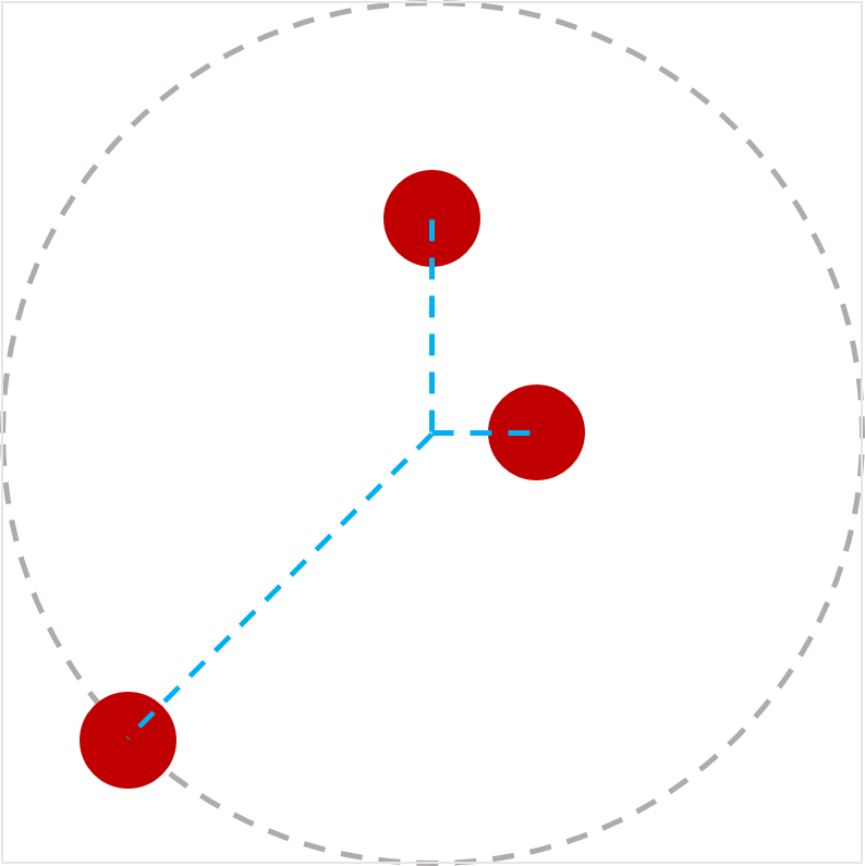
< style >
body {
width : 300 px ;
height : 300 px ;
margin : 0 px ;
border : solid gray ;
border-radius : 50 % ;
}
. circle {
offset-position : 150 px 150 px ;
offset-distance : 86 % ;
width : 42 px ;
height : 42 px ;
background-color : mediumpurple ;
border-radius : 50 % ;
display : flex ;
align-items : center ;
justify-content : center ;
}
# item1 {
offset-path : ray ( 0 deg closest -side );
offset-rotate : auto 90 deg ;
}
# item2 {
offset-path : ray ( 45 deg closest -side );
offset-rotate : auto 90 deg ;
}
# item3 {
offset-path : ray ( 135 deg closest -side );
offset-rotate : auto -90 deg ;
}
# item4 {
offset-path : ray ( 180 deg closest -side );
offset-rotate : auto -90 deg ;
}
# item5 {
offset-path : ray ( 225 deg closest -side );
offset-rotate : reverse 90 deg ;
}
# item6 {
offset-path : ray ( -45 deg closest -side );
offset-rotate : reverse -90 deg ;
}
</ style >
< body >
< div class = "circle" id = "item1" > 1</ div >
< div class = "circle" id = "item2" > 2</ div >
< div class = "circle" id = "item3" > 3</ div >
< div class = "circle" id = "item4" > 4</ div >
< div class = "circle" id = "item5" > 5</ div >
< div class = "circle" id = "item6" > 6</ div >
</ body >
2.6. offset 简写
| 名称: | offset |
|---|---|
| 取值: | [ <'offset-position'>? [ <'offset-path'> [ <'offset-distance'> || <'offset-rotate'> ]? ]? ]! [ / <'offset-anchor'> ]? |
| 初始值: | 参见独立属性 |
| 适用于: | 可变形元素 |
| 继承性: | 参见独立属性 |
| 百分比: | 参见独立属性 |
| 计算值: | 参见独立属性 |
| 动画类型: | 参见独立属性 |
| 规范顺序: | 按语法 |
测试
- offset-interpolation.html (live test) (源码)
- offset-position-composition.html (live test) (源码)
- offset-position-interpolation.html (live test) (源码)
- offset-parsing-invalid.html (live test) (源码)
- offset-parsing-valid.html (live test) (源码)
- offset-shorthand.html (实时测试) (源码)
- inheritance.html (实时测试) (源码)
- offset-supports-calc.html (实时测试) (源码)
这是一个用于设置 offset-position、offset-path、offset-distance、offset-rotate 和 offset-anchor 的简写属性。省略的值将设置为其初始值。
2.7. 计算偏移变换
偏移变换是一个二维变换, 先平移后旋转:
-
通过 offset-rotate 指定的角度旋转元素。
3. <basic-shape> 的等效路径
[css-shapes] 给出的 <basic-shape> 定义将每个函数定义为生成一个形状——一个具有轮廓、内部和外部的二维图形。
本规范 invece 使用 <basic-shape> 生成一条路径——一条具有起点、终点和方向的线, 它恰好描绘出特定形状的轮廓。 构成路径的细节由 SVG 定义。 [SVG2]
所有 <basic-shape> 值的等效路径是:
- <path()>
- <shape()>
-
路径是已定义的路径。 [SVG11]
- <circle()>
- <ellipse()>
-
路径是圆形/椭圆形的轮廓。 它从圆形/椭圆的最右点开始, 然后由四个圆弧组成, 每个圆弧构成圆形/椭圆的四分之一, 顺时针进行, 最后以完成段的闭合路径操作结束。
- rect()
- inset()
- xywh()
-
路径是(可能为圆角的)矩形的轮廓, 由四个或八个段组成 (取决于是否指定了圆角), 并以完成段的闭合路径操作结束。 它从顶部直边的左端开始, 紧邻任何圆角的右侧, 并向右(顺时针)继续。
- <polygon()>
-
路径是多边形的轮廓, 由连接每个坐标对到下一个坐标对的直线段组成, 最后将最后一个连接回第一个, 并使用完成段的闭合路径操作。
对于所有这些, 路径上任意一点的方向 由 SVG 定义; 请参阅 SVG 2 § 9.4 路径方向性。
注意:所有这些都旨在匹配为类似的 SVG 形状元素定义的“等效路径”。
注意:此列表应与 [css-shapes] 中定义的 <basic-shape> 函数的完整集合保持同步。 如果缺少任何内容, 则应将其视为规范错误。 此列表将来可能会移至 Shapes, 但目前仍保留在此处, 因为此规范是此信息的唯一使用者。
4. 隐私注意事项
本规范未引入新的隐私注意事项。
5. 安全注意事项
本规范未引入新的安全注意事项。
变更
本节内容不具约束力。
自 2018年12月18日 工作草案以来的变更
-
添加了 offset-position:normal,它不会覆盖正常的默认定位,并在 ray() 中添加了 "at <position>" #504。
-
将 offset-path 更正为使用 <url> 而不是 <url()> #508
-
使用 CSS Transforms 1 中的术语重写了偏移变换的计算
-
阐明了 "offset-distance" 和 "offset-rotate"
-
简化并阐明了 "contain" 关键字的行为 #363。
-
更改了 circle()/ellipse() 的等效路径以匹配 SVG #506。
-
coord-box 引用的元素是为变换后的元素建立包含块的元素,在 SVG 上下文中,coord-box 被视为 view-box #369
-
将 <basic-shape> 路径的定义移至附录。
-
允许 <coord-box> 与任何路径函数组合 #369
-
阐明了初始位置
-
将 path() 移至 <basic-shape> 部分。
-
使 <ray-size> 可选,默认为 "closest-side"。
-
重写了引言。
-
将 ray() 定义移至其自己的小节
-
阐明了偏移路径的定义 #66
-
阐明了 <coord-box> 类型在 CSS Box 3 中定义。
-
更正了 <ray()> 和 <path()> 类型语法。
-
阐明了 "modulo" 具有其数学定义,而不是 C/JS 定义 #339。
-
修复了锐利路径边界处的方向性以匹配 SVG。 #209。
-
重新组织了 offset-path 部分以提高可读性。
-
删除了描述极角概念的注释。
-
将 offset-distance 的计算值更改为计算的
值。 -
将 animatable 替换为 Animation type。
自 2015年4月9日首次公开发布工作草案以来的变更
-
将 motion-path 重命名为 offset-path 以便与 polar-angle 集成。
-
将 motion-offset 重命名为 offset-distance 以便与 polar-distance 集成。
-
将 motion-rotation 重命名为 offset-rotate。
-
添加了 offset-position 属性,通过合并 [CSS-ROUND-DISPLAY-1] 中的 polar-origin 来指定路径的偏移起始位置。
-
添加了 offset-anchor 属性,通过合并 [CSS-ROUND-DISPLAY-1] 中的 polar-anchor 来指定元素的原点。
-
使 offset-rotate 通过 auto 或 reverse 与 <angle> 组合来指定旋转变换。
致谢
感谢 fantasai、 Hyojin Song 以及 CSS 工作组所有其他成员 的审阅、评论和指正。