1. 引言
本节不具规范性。
形状定义了可用作 CSS 值的任意几何图形。 本规范定义了用于控制元素浮动区域几何形状的属性。 shape-outside 属性使用形状值来定义浮动元素的浮动区域。
注意: 未来级别的 CSS 形状将允许在浮动元素以外的元素上使用形状。 其他 CSS 模块也可以使用形状,例如 CSS 遮罩 [CSS-MASKING] 和 CSS 排除 [CSS3-EXCLUSIONS]。
注意: 如果用户代理同时实现了 CSS 形状和 CSS 排除, shape-outside 属性将定义排除项的排除区域。
注意: 未来级别的 CSS 形状将定义一个 shape-inside 属性, 该属性将定义一个形状以在元素内环绕内容。
1.1. 模块交互
本模块扩展了 [CSS2] 第 9 章中定义的浮动功能。
1.2. 值
本规范遵循 [CSS2] 中的 CSS 属性定义约定,并使用 [CSS-VALUES-3] 中的值定义语法。 本规范中未定义的值类型在 CSS 值与单位 [CSS-VALUES-3] 中定义。 与其他 CSS 模块的组合可能会扩展这些值类型的定义。
除了其定义中列出的特定于属性的值之外, 本规范中定义的所有属性 也接受 CSS 范围关键字作为其属性值。 为便于阅读,未明确重复它们。
1.3. 术语
环绕
本规范使用术语环绕来指代在浮动区域两侧流动的内容, 该区域在 [CSS2] 第 9 章中定义。 内容环绕在左浮动框的右侧, 内容环绕在右浮动框的左侧。 这种环绕的一个结果是,浮动元素旁边的行框 会根据需要缩短 以避免与浮动区域相交。
浮动区域
用于在浮动元素周围环绕内容的区域。 浮动行为的规则 使用浮动区域的侧边来确定内容流向。 默认情况下, 浮动区域是浮动元素的外边距框(请注意,这可能与 由 margin-box 值产生的浮动区域不同, 后者包括 border-radius 曲率)。 本规范的 shape-outside 和 shape-margin 属性 可用于定义任意的、 非矩形的浮动区域。
与方向无关的大小 盒子的与方向无关的大小等于盒子对角线的长度 除以 sqrt(2)。
注意: 这是 SVG 在某些情况下使用的一种平均盒子宽度和高度的方法, 当需要盒子大小的百分比 但上下文不特别偏向宽度或高度时。 对于正方形盒子,这与宽度/高度相同。
2. 与盒模型和浮动行为的关系
虽然用于环绕浮动元素外部的内联流内容的边界可以使用形状来定义,但实际的盒模型不会改变。 如果元素指定了外边距、边框或内边距,它们将根据 [CSS3BOX] 模块进行计算和渲染。 此外,浮动定位和堆叠不受通过形状定义浮动区域的影响。
当使用形状来定义浮动区域时,形状会被裁剪到浮动元素的外边距框。 换句话说,形状只能缩小浮动区域,而不能扩大它。 缩小的浮动区域可能对某些通常会受浮动影响的行框没有影响。 如果形状不包围任何区域,形状的边缘仍用于定义浮动区域。
由形状定义的浮动区域可能会在所有侧面缩小正常的浮动区域,但这并不允许内容在浮动元素的两侧环绕。 带有 shape-outside 的左浮动元素仍然只允许内容在右侧环绕,而右浮动元素只允许在左侧环绕。
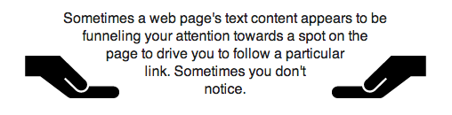
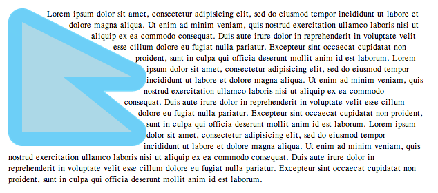
在下面的示例中,左右浮动的 img 元素使用 shape-outside 属性指定了一个三角形形状。
<img class="left" src="hand.svg"/>
        <img class="right" src="hand.svg"/>
        <p>
          有时,网页的文本内容似乎将您的注意力引向页面上的某个点,以促使您点击某个特定链接。有时您不会注意到。
        </p>

        <style type="text/css">
          .left {
            shape-outside: polygon(0 0, 100% 100%, 0 100%);
            float: left;
            width: 40%;
            height: 12ex;
            transform: scaleX(-1);
          }

          .right {
            shape-outside: polygon(100% 0, 100% 100%, 0 100%);
            float: right;
            width: 40%;
            height: 12ex;
          }

          p {
            text-align: center;
          }
        </style>
一个不包围任何区域的形状仍然有构成浮动区域的边缘。
这个 inset 形状是一条位于参考框中点的垂直线。 这个中点边缘被用作环绕内容的浮动区域的边缘。
shape-outside: inset(0% 50% 0% 50%);
如果 inset 值的总和超过宽度,则使用 CSS 背景 3 § 4.5 重叠曲线规则来确定矩形的边缘。 这个形状会产生一条距离参考框左侧 25% 的垂直边缘。
shape-outside: inset(0% 150% 50% 0%);
如果形状只是一条水平线,那么它是一个空的浮动区域,对环绕没有影响。 请注意,在此示例中,shape-margin 必须为 0px (否则该线将扩展以包围一个区域)。
shape-outside: inset(50% 0% 0% 50%);
        shape-margin: 0px;
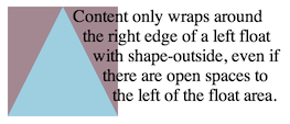
shape-outside 可以在浮动区域的左侧和右侧创建开放区域。 在这种情况下,内容仍然只在浮动元素的一侧环绕。 在图中,形状以蓝色渲染,形状外的内容区域以淡紫色渲染。
shape-outside: polygon(50px 0px, 100px 100px, 0px 100px);
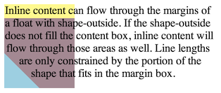
以下样式创建了一个比浮动元素内容区域小得多的形状,并为浮动元素添加了 margin-top。 在图中,形状以蓝色渲染,形状外的内容区域以淡紫色渲染,浮动框的外边距区域以黄色渲染。 内联内容仅环绕形状,否则会覆盖浮动外边距框的其余部分。
.float-left {
          shape-outside: polygon(0% 50%, 50% 100%, 0 100%);
          float: left;
          width: 100px;
          height: 100px;
          margin-top: 20px;
        }
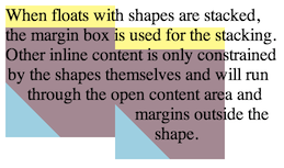
下一张图显示了如果将两个这样的浮动元素并排堆叠可能产生的结果。 请注意,浮动元素是使用其外边距框定位的,而不是浮动区域。
3. 基本形状
<basic-shape> 类型 可以使用基本形状函数指定。 当使用此语法 定义形状时, 参考框由使用 <basic-shape> 值的每个属性定义。 形状的坐标系 原点位于参考框的左上角,x 轴 向右延伸, y 轴向下延伸。 所有以百分比表示的长度 都根据参考框的已用尺寸进行解析。
3.1. 支持的形状
<basic-shape> 函数是:
<inset()> = inset(
  <length-percentage>{1,4}
  [ round <'border-radius'> ]?
)

<xywh()> = xywh(
  <length-percentage>{2} <length-percentage [0,∞]>{2}
  [ round <'border-radius'> ]?
)

<rect()> = rect(
  [ <length-percentage> | auto ]{4}
  [ round <'border-radius'> ]?
)

<basic-shape-rect> = <inset()> | <rect()> | <xywh()>

<circle()> = circle(
  <radial-size>?
  [ at <position> ]?
)

<ellipse()> = ellipse(
  <radial-size>?
  [ at <position> ]?
)

<polygon()> = polygon(
  <'fill-rule'>?
  [ round <length> ]? ,
  [<length-percentage> <length-percentage>]#
)

<path()> = path(
  <'fill-rule'>? ,
  <string>
)

<shape()> = shape(
  <'fill-rule'>?
  from <position>
  <shape-command>#
)
- inset()
-
通过从参考框的每个边缘进行内嵌来定义一个内嵌矩形。
如果提供的 <length-percentage> 值少于四个, 则省略的值将以与 margin 简写相同的方式进行默认: 省略的第二个或第三个值默认为第一个, 省略的第四个值默认为第二个。
四个 <length-percentage> 分别定义矩形的上、右、下和左边缘的位置, 作为距参考框相应边缘的内嵌。
任一维度中的一对内嵌 相加超过已用维度 (例如左右内嵌各为 75%) 时,使用 CSS 背景 3 § 4.5 重叠曲线规则 按比例将内嵌效果减少到 100%。
可选的 <'border-radius'> 参数 使用 border-radius 简写语法为矩形定义圆角。
- xywh()
-
通过从参考框的顶部和左侧边缘的偏移量以及指定的宽度和高度来定义一个矩形。
四个 <length-percentage> 分别定义 距参考框左边缘的内嵌, 距参考框上边缘的内嵌, 矩形的宽度, 和矩形的高度。
注意: 此语法的灵感来自 SVG 的
viewBox属性。可选的 <'border-radius'> 参数 使用 border-radius 简写语法为内嵌矩形定义圆角。
- rect() =
-
通过从参考框的顶部和左侧边缘的内嵌来定义一个矩形。
四个 <length-percentage> 分别定义矩形的上、右、下和左边缘的位置, 作为距参考框上边缘(对于第一个和第三个值) 或参考框左边缘(对于第二个和第四个值)的内嵌。
auto 值使盒子的边缘 与参考框的相应边缘重合: 它等同于作为第一个(上)或第四个(左)值的 0%, 等同于作为第二个(右)或第三个(下)值的 100%。
第二个(右)和第三个(下)值分别 被第四个(左)和第二个(上)值向下取整。
例如,指定 rect(10px 0 0 20px) 会将下边缘置于上边缘之上, 并将右边缘置于左边缘的更左侧, 因此两者都被校正为不越过另一边缘, 与指定 rect(10px 20px 10px 20px) 相同。注意: 此语法与 仅由 clip 属性使用的旧版 rect() 函数相似, 但不完全相同。
可选的 <'border-radius'> 参数 使用 border-radius 简写语法为矩形定义圆角。)
- circle()
-
-
<radial-size> 参数定义 圆的半径。 值是相对于参考框解析的,而不是引用渐变框。
-
两个 <length-percentage> 值是无效的。
<position> 参数定义 圆的中心。 除非另有说明, 如果省略,则默认为 center。
-
- ellipse()
-
-
<radial-size> 参数定义 椭圆的水平和垂直半径。 值是相对于参考框解析的,而不是引用渐变框。
-
<position> 参数定义 椭圆的中心。 除非另有说明, 如果省略,则默认为 center。
-
- polygon()
-
-
<'fill-rule'> 指定用于确定内部的填充规则。 如果省略,则默认为 nonzero。
-
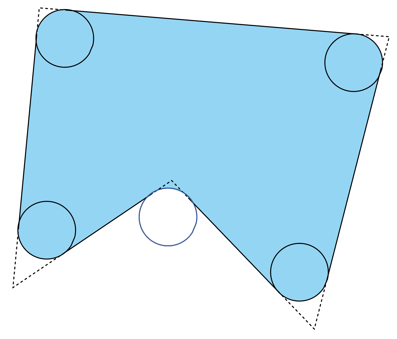
在 round 关键字后的可选 <length> 为多边形的每个顶点定义圆角。 该长度是一个圆的半径, 该圆的圆心位于顶点较小角的平分线上, 并且与顶点的两条边相切。
为避免圆角超过任何线段的一半, 每个顶点的圆角 必须单独进行限制, 以使半径永远不会超过 对两个顶点线段评估的
tan(angle/2) segment / 2的较小值。 -
每个 <length-percentage> 对 指定多边形的一个顶点, 作为距参考框左边缘和上边缘的水平和垂直偏移。
UA 必须通过将最后一个顶点 与列表的第一个顶点连接来闭合多边形。
-
- path()
-
-
<'fill-rule'> 指定用于确定内部的填充规则。 如果省略,则默认为 nonzero, 除非该函数在诸如 SVG 形状之类的上下文中使用, 其中 fill-rule 属性是相关的。 在这种情况下,省略的值将使用 fill-rule 属性的计算值。
-
<string> 表示一个 SVG 路径数据字符串。 不符合 SVG 1.1 的语法和解析规则的路径数据字符串, 或者符合但定义了空路径的路径数据字符串, 是无效的,并导致整个 path() 无效。
初始位置由路径字符串中的第一个“move to”参数定义。 对于初始方向,请遵循 SVG 1.1。
对于需要闭合循环的属性(例如 shape-outside 和 clip-path),如果字符串中不存在,UA 必须使用隐式的 closepath 命令(“z”或“Z”)闭合路径。
-
- shape()
-
请参阅 shape() 函数。
测试
3.1.1. shape() 函数
虽然 path() 函数允许重用 SVG 路径语法来定义比更专业的形状函数所允许的更任意的形状,但它需要将路径编写为单个字符串(这与例如使用 var() 逐段构建路径不兼容),并且继承了 SVG 的许多限制,例如隐式地只允许 px 单位。
shape() 函数使用一组与 path() 使用的命令大致相当的命令,但它使用更标准的 CSS 语法,并允许完整的 CSS 功能,例如额外的单位和数学函数。 当用于渲染时(例如,在计算渲染的 clip-path 时),shape() 使用的命令会动态地转换为路径段。
从这个意义上说,shape() 是 path() 的超集。一个 path() 可以很容易地转换为一个 shape(),但要将一个 shape() 转换回一个 path() 或 SVG,则需要有关 CSS 环境的信息(例如,CSS 自定义属性的当前值,用于 em 单位的当前字体大小等)。
<'fill-rule'> 的解释与 path() 中的相同参数完全相同。
其余参数定义了一个路径数据命令列表,与 SVG 路径的命令列表相同,该函数表示该列表。
from <coordinate-pair> 表示第一个形状命令的起点。 它向路径数据命令列表添加一个初始的绝对 moveto。
<shape-command> 的序列表示 更多的 路径数据命令。 每个命令的起点是前一个命令的终点。
<shape-command> = <move-command> | <line-command> | close |
                  <horizontal-line-command> | <vertical-line-command> |
                  <curve-command> | <smooth-command> | <arc-command>

<move-command> = move <command-end-point>
<line-command> = line <command-end-point>
<horizontal-line-command> = hline
        [ to [ <length-percentage> | left | center | right | x-start | x-end ]
        | by <length-percentage> ]
<vertical-line-command> = vline
        [ to [ <length-percentage> | top | center | bottom | y-start | y-end ]
        | by <length-percentage> ]
<curve-command> = curve
        [ [ to <position> with <control-point> [ / <control-point> ]? ]
        | [ by <coordinate-pair> with <relative-control-point> [ / <relative-control-point> ]? ] ]
<smooth-command> = smooth
        [ [ to <position> [ with <control-point> ]? ]
        | [ by <coordinate-pair> [ with <relative-control-point> ]? ] ]
<arc-command> = arc <command-end-point>
            [ [ of <length-percentage>{1,2} ]
              && <arc-sweep>? && <arc-size>? && [rotate <angle>]? ]

<command-end-point> = [ to <position> | by <coordinate-pair> ]
<control-point> = [ <position> | <relative-control-point> ]
<relative-control-point> = <coordinate-pair> [ from [ start | end | origin ] ]?
<coordinate-pair> = <length-percentage>{2}
<arc-sweep> = cw | ccw
<arc-size> = large | small
- <coordinate-pair> = <length-percentage>{2}
- 定义一对坐标, 分别表示距指定参考点的向右和向下偏移量。 百分比分别根据参考框的宽度或高度进行解析。
- <command-end-point> = [ to <position> | by <coordinate-pair> ]
-
每个命令都可以用“绝对”或“相对”坐标指定,
由其 by 或
to 组件决定。
to 表示命令中的任何 <coordinate-pair>
都相对于参考框的左上角,
而 by 表示 <coordinate-pair>
相对于命令的起点。
<relative-control-point> 定义了如何为曲线控制点解释 by 和 to, 而 <horizontal-line-command> 和 <vertical-line-command> 分别定义了如何为水平线和垂直线解释 by 和 to。
当使用 to 时,坐标可以指定为 <position> 而不是 <coordinate-pair>。
注意:在任何一种情况下,<coordinate-pair> 中的 <percentage> 值 始终相对于参考框的大小进行计算。
- <move-command> = move <command-end-point>
-
向路径数据命令列表添加一个 moveto 命令,
其终点由 <coordinate-pair> 指定。
这不会绘制任何内容, 只是为下一个命令“移动画笔”。
注意:为了 close 命令的目的,这会开始一个新的子路径。
- <line-command> = line <command-end-point>
-
向路径数据命令列表添加一个 lineto 命令,
其终点由 <coordinate-pair> 指定。
这会从命令的起点到其终点绘制一条直线。
- <horizontal-line-command> = hline [ to [ <length-percentage> | left | center | right | x-start | x-end ] | by <length-percentage> ]
-
向路径数据命令列表添加一个水平 lineto
命令。
这等效于一个 line 命令, 其中给定的 <length-percentage> 作为 <coordinate-pair> 的水平分量。 指定 <position> 的水平分量而不是 <length-percentage>(left、center、right、x-start 或 x-end), 将绘制一条到该 <position> 的线,其中 <position> 的垂直分量与起点保持相同。
- <vertical-line-command> = vline [ to [ <length-percentage> | top | center | bottom | y-start | y-end ] | by <length-percentage> ]
-
向路径数据命令列表添加一个垂直 lineto 命令。
这等效于一个 line 命令, 其中给定的 <length-percentage> 作为 <coordinate-pair> 的垂直分量。 指定 <position> 的水平分量(top、center、bottom、y-start 或 y-end) 而不是 <length-percentage>, 将绘制一条到该 <position> 的线,其中 <position> 的水平分量与起点保持相同。
- <curve-command> = curve [ [ to <position> with <control-point> [ / <control-point> ]? ] | [ by <coordinate-pair> with <relative-control-point> [ / <relative-control-point> ]? ] ]
-
向路径数据命令列表添加一个贝塞尔曲线命令,
结束于 to
关键字后的 <position> 指定的点,
或 by
关键字后的 <coordinate-pair>,如
<command-end-point> 所指定。
with 组件指定曲线的控制点: 如果提供单个 <control-point> 或 <relative-control-point>, 则该命令指定一条二次曲线; 如果提供两个 <control-point> 或 <relative-control-point>, 则指定一条三次曲线。
- <smooth-command> = smooth [ [ to <position> [with <control-point> ]? ] | [ by <coordinate-pair> [ with <relative-control-point> ]? ] ]
-
向路径数据命令列表添加一个平滑贝塞尔曲线命令,
结束于 to
关键字后的 <position> 指定的点,或
by 关键字后的
<coordinate-pair>,如
<command-end-point> 所指定。
with 组件指定曲线的控制点:
如果省略,
该命令指定一条平滑二次曲线;
如果提供,
则指定一条平滑三次曲线。
注意:smooth 命令等效于 一个 curve 命令, 其第一个控制点自动指定为 前一个曲线的第二个控制点 围绕起点的反射, 如果前一个路径数据命令不是曲线,则为起点。 这确保了与前一个命令的 G1 连续性, 因此曲线看起来是从前一个命令平滑延续的, 而不是可能突然改变方向。
- <control-point> = [ <position> | <relative-control-point> ]
- 为二次或三次贝塞尔曲线提供一个控制点。
- <relative-control-point> = <coordinate-pair> [ from [ start | end | origin ] ]?
- 为二次或三次贝塞尔曲线提供一个控制点。 当指定一个 from 关键字后跟 start、 end 或 origin 时, 给定的 <coordinate-pair> 分别相对于 命令的起点、命令的终点或参考框。 如果未提供此类组件,则 <coordinate-pair> 相对于 段的起点。
- <arc-command> = arc <command-end-point> [of <length-percentage>{1,2}] && <arc-sweep>? && <arc-size>? && rotate <angle>? ]
-
向路径数据命令列表添加一个椭圆弧
命令,
结束于 <command-end-point>。
of 组件指定弧线所取自的椭圆的大小。 第一个 <length-percentage> 提供椭圆的水平半径, 第二个提供垂直半径。 与 <coordinate-pair> 类似,<percentage> 值分别根据参考框的宽度或高度进行解析。
如果只提供一个 <length-percentage>, 则两个半径都使用提供的值。 在这种情况下,<percentage> 值根据与方向无关的大小的参考框进行解析 (类似于 circle() 函数)。
请注意,SVG 对椭圆半径有一些特定的错误处理:-
如果终点与起点相同,则该命令不执行任何操作
-
如果任一半径为零,则该命令等效于到终点的 <line-command>
-
如果任一半径为负,则使用其绝对值
-
如果半径描述的椭圆不够大, 无法与起点和终点相交 (在按指定的 <angle> 旋转后), 它们将按比例均匀放大,直到椭圆刚好足够大以到达。
由指定半径描述的椭圆默认为轴对齐, 但可以通过指定一个 <angle> 来旋转。 与 rotate() 变换函数类似, 正角度指定顺时针旋转, 负角度指定逆时针旋转。 如果省略,则默认为 0deg。
终点、半径和角度, 综合起来, 通常定义了两个可能的椭圆, 它们与起点和终点相交, 并且每个椭圆可以沿任一方向绘制, 总共有四个可能的弧。 <arc-sweep> 和 <arc-size> 组件指定需要哪一个弧:
-
<arc-sweep> 可以是 cw 或 ccw, 分别表示必须选择 从中心顺时针或逆时针围绕椭圆绘制的弧。 如果省略,则默认为 ccw。
-
<arc-size> 可以是 large 或 small, 分别表示必须选择 两个可能弧中较大或较小的一个。 如果省略,则默认为 small。
注意:在 SVG 弧命令中,large 对应于 large 标志的值 1, 而 small 对应于 0。
注意:如果起点和终点 恰好在椭圆的相对两侧, 则两个可能的弧大小相同, 但也只有一个可能的椭圆。 在这种情况下,<arc-sweep> 区分将选择哪两个可能的弧, 而 <arc-size> 没有效果。

描绘了两个可能的椭圆, 以及四个可以从中选择的可能弧。 -
- close
-
向路径数据命令列表添加一个 closepath 命令。
注意:这类似于一个 line 命令, 其终点设置为子路径的起点。 在指定原始形状时,它们是相同的, 但如果路径被描边, close 命令的终点会平滑地连接 到子路径的起点, 这会影响线连接和线帽的渲染方式。
3.1.1.1. 使用 shape() 创建响应式、参数化的语音气泡
为了演示,我们从一个语音气泡开始,如下所示:

将此形状与 clip-path 一起使用可以通过 path() 函数来完成:
.bubble{ clip-path : path ( "m 5 0 H 95 Q 100 0 100 5 V 92 Q 100 97 95 97 H 70 l -2 3 l -2 -3 H 5 Q 0 97 0 92 V 5 Q 0 0 5 0" ) };
虽然这个路径可以轻松缩放,但缩放后的结果并不总是理想的。例如,当缩放到一个小气球时,箭头和圆角会缩放到几乎看不见:
要使用 shape() 函数构造此形状,我们首先将 path 函数中的所有像素值转换为百分比。 请注意,shape() 函数以 from 开头:
.bubble{ clip-path : shape ( from5 % 0 % , hline to95 % , curve to100 % 5 % with100 % 0 % , vline to92 % , curve to95 % 97 % with100 % 97 % , hline to70 % , line by-2 % 3 % , line by-2 % -3 % , hline to5 % , curve to0 % 92 % with0 % 97 % , vline to5 % , curve to5 % 0 % with0 % 0 % ); }
为了使此路径具有响应性,即能够很好地响应大小变化,我们将其中一些单位转换为 px 值, 特别是控制曲线和箭头的单位:
.bubble{ clip-path : shape ( from5 px 0 % , hline tocalc ( 100 % -5 px ), curve to100 % 5 px with100 % 0 % , vline tocalc ( 100 % -8 px ), curve tocalc ( 100 % -5 px ) calc ( 100 % -3 px ) with100 % calc ( 100 % -3 px ), hline to70 % , line by-2 px 3 px , line by-2 px -3 px , hline to5 px , curve to0 % calc ( 100 % -8 px ) with0 % calc ( 100 % -3 px ), vline to5 px , curve to5 px 0 % with0 % 0 % ); }
当作为 clip-path 应用时,它看起来像下面这样:

整个语音气泡会缩放到参考框,而曲线和箭头则保持更恒定的大小。
由于 shape() 使用 CSS 单位,我们可以用 position 值替换一些边缘:
.bubble{ clip-path : shape ( from5 px 0 , hline tocalc ( 100 % -5 px ), curve to right5 px with right top, vline tocalc ( 100 % -8 px ), curve tocalc ( 100 % -5 px ) calc ( 100 % -3 px ) with rightcalc ( 100 % -3 px ), hline to70 % , line by-2 px 3 px , line by-2 px -3 px , hline to5 px , curve to leftcalc ( 100 % -8 px ) with leftcalc ( 100 % -3 px ), vline to5 px , curve to5 px top with left top); }
shape() 的另一个有用功能是它可以与 CSS 属性一起使用。在这种情况下, 我们可以使箭头和半径参数化:
:root{ --radius : 5 px ; --arrow-length : 3 px ; --arrow-half-width : 2 px ; --arrow-position : 70 % ; --arrow-bottom-offset : calc ( 100 % -var ( --radius) -var ( --arrow-length)); } .bubble{ animation : bubble100 ms ; clip-path : shape ( fromvar ( --radius) top, hline tocalc ( 100 % -var ( --radius)), curve to rightvar ( --radius) with right top, vline tovar ( --arrow-bottom-offset), curve tocalc ( 100 % -var ( --radius)) calc ( 100 % -var ( --arrow-length)) with rightcalc ( 100 % -var ( --arrow-length)), hline tovar ( --arrow-position), line byvar ( --arrow-half-width) var ( --arrow-length), line byvar ( --arrow-half-width) calc ( 0 px -var ( --arrow-length)), hline tovar ( --radius), curve to leftvar ( --arrow-bottom-offset) with leftcalc ( 100 % -var ( --arrow-length)), vline tovar ( --radius), curve tovar ( --radius) top with left top); }
3.1.1.2. shape() 函数的插值
shape() 和 path() 函数可以相互插值 ,前提是它们关联的路径数据命令列表长度相同 且按顺序具有相同的命令,其中 path() 函数的第一个命令与 shape() 函数中的初始 <coordinate-pair> 进行插值。
注意:path() 函数的第一个命令保证是 move,请参阅 SVG 规范中的 moveTo。
如果起始值和结束值都是 path() 函数, 则插值结果是一个 path() 函数; 否则它是一个 shape() 函数。 在任何一种情况下, 插值结果都必须表示相同的路径数据命令列表, 其中每个命令的数值分量都在 起始和结束列表的相应分量之间进行插值。
为此,如果命令使用相同的命令关键字 和相同的 <by-to> 关键字,则它们是“相同的”。 对于 curve 和 smooth,它们还必须具有相同数量的控制点。
如果一个 arc 命令在其起始和结束列表之间具有不同的 <arc-sweep>, 则插值结果对 0 和 1 之间的任何进度值都使用 cw。 如果它具有不同的 <arc-size> 关键字, 则插值结果对 0 和 1 之间的任何进度值都使用 large。
注意:arc 关键字插值规则
旨在匹配现有的 SVG
path
插值规则。
3.2. 基本形状的计算值
<basic-shape> 函数中的值按指定计算,但有以下例外:
- 省略的值会被包含并计算为其默认值。
- circle() 或 ellipse() 中的 <position> 值被计算为距左上角原点的一对偏移量(先水平后垂直),每个偏移量都以 <length-percentage> 给出。
- <basic-shape-rect> 函数中的 <'border-radius'> 值 被计算为所有八个 <length-percentage> 值的展开列表。
-
所有 <basic-shape-rect> 函数都计算为等效的
inset() 函数。
注意:给定 rect(t r b l), 等效函数是 inset(t calc(100% - r) calc(100% - b) l)。 给定 xywh(x y w h), 等效函数是 inset(y calc(100% - x - w) calc(100% - y - h) x)。
测试
- shape-image-threshold-computed.html (实时测试) (源码)
- shape-margin-computed.html (实时测试) (源码)
- shape-outside-computed.html (实时测试) (源码)
- circle-function-computed.html (实时测试) (源码)
- ellipse-function-computed.html (实时测试) (源码)
- inset-function-computed.html (实时测试) (源码)
- path-function-computed.html (实时测试) (源码)
- polygon-function-computed.html (实时测试) (源码)
- rect-function-computed.html (实时测试) (源码)
- xywh-function-computed.html (实时测试) (源码)
- shape-outside-computed-shape-000.html (实时测试) (源码)
- shape-outside-computed-shape-001.html (实时测试) (源码)
3.3. 基本形状的序列化
要序列化 <basic-shape> 函数, 请按照其各自的语法进行序列化, 顺序与语法编写的顺序一致, 用单个空格连接以空格分隔的标记, 并在每个序列化的逗号后跟一个空格。 对于序列化计算值, 组件值是计算的, 并在可能的情况下省略而不改变其含义。
由于形状函数的指定值序列化相对简单, 以下是一些在 shape-outside 中使用时,circle() 符号的计算值序列化示例:
-
<position> 的序列化规则 意味着 关键字会计算为百分比, 并按水平-垂直的顺序序列化。
circle(at bottom left) /* 序列化为 */ circle(at 0% 100%) -
省略可选组件意味着 默认值不会出现在序列化结果中。
circle(closest-side at center) /* 序列化为 */ circle() -
rect(10px 20px 30px 40px)
        /* 序列化为 */
        inset(10px calc(100% - 20px) calc(100% - 30px) 40px)
3.4. 基本形状的插值
对于在 一个基本形状和第二个基本形状之间进行插值, 适用以下规则。 形状函数中的值按计算值进行插值。 列表值在可能的情况下作为 长度、百分比或 calc 进行插值。 如果列表值不是这些类型之一 但完全相同 (例如在两个列表的相同列表位置都找到 nonzero) ,这些值也会进行插值。
- 两个形状都必须使用相同的参考框。
- 如果两个形状是相同类型, 该类型是 ellipse() 或 circle(), 并且半径被指定为 <length-percentage>(而不是关键字), 则在形状函数中的每个值之间进行插值。
- 如果两个形状都是 inset() 类型, 则在形状函数中的每个值之间进行插值。
- 如果两个形状都是 polygon() 类型, 两个多边形具有相同数量的顶点, 并使用相同的 <'fill-rule'>, 则在形状函数中的每个值之间进行插值。
- 在所有其他情况下,未指定插值。
测试
4. 来自图像的形状
定义形状的另一种方法是指定一个源 <image>,其 Alpha 通道用于计算形状。 形状被计算为包围指定图像不透明度大于 shape-image-threshold 值的区域的路径。 没有任何像素的 Alpha 值大于指定的阈值会导致一个空的浮动区域,该区域不会影响环绕。 如果未指定 shape-image-threshold, 则要考虑的初始值为 0.0。
图像的大小和位置就好像它是一个被替换的元素,其指定的宽度和高度与元素的已用内容框大小相同。
对于动画光栅图像格式(例如 GIF), 将使用动画序列的第一帧。
一张图片浮动在段落的左侧。 该图片在透明背景上显示了 CSS 标志的 3D 版本。 该标志使用 Alpha 通道带有阴影。
该图像通过 shape-outside 属性定义其浮动区域。
    <p>
    <img id="CSSlogo" src="CSS-logo1s.png"/>
    一些文字一些文字一些文字...
    </p>

    <style>
    #CSSlogo {
        float: left;
        shape-outside: attr(src url);
        shape-image-threshold: 0.1;
    }
    </style>
shape-outside 属性重用了 img 元素的 src 属性中的 url。
完全可以显示一张图像,并使用另一张图像作为其浮动区域。
在下图中,Alpha 通道阈值由 CSS 标志周围的虚线表示。
然后可以通过三种方式影响段落行的起始位置:
- 修改图像中的 Alpha 通道
- 更改 shape-image-threshold 属性的值
- 更改 shape-margin 属性的值(见示例 8)
测试
- shape-image-threshold-interpolation.html (在线测试) (源码)
- shape-image-threshold-computed.html (在线测试) (source)
- shape-image-threshold-invalid.html (在线测试) (source)
- shape-image-threshold-valid.html (在线测试) (source)
- float-retry-push-image.html (在线测试) (source)
- shape-outside-linear-gradient-001.html (在线测试) (source)
- shape-outside-linear-gradient-002.html (在线测试) (source)
- shape-outside-linear-gradient-003.html (在线测试) (source)
- shape-outside-linear-gradient-004.html (在线测试) (source)
- shape-outside-linear-gradient-005.html (在线测试) (source)
- shape-outside-linear-gradient-006.html (在线测试) (source)
- shape-outside-linear-gradient-007.html (在线测试) (source)
- shape-outside-linear-gradient-008.html (在线测试) (source)
- shape-outside-linear-gradient-009.html (在线测试) (source)
- shape-outside-linear-gradient-010.html (在线测试) (source)
- shape-outside-linear-gradient-011.html (在线测试) (source)
- shape-outside-linear-gradient-012.html (在线测试) (source)
- shape-outside-linear-gradient-013.html (在线测试) (source)
- shape-outside-linear-gradient-014.html (在线测试) (source)
- shape-outside-linear-gradient-015.html (在线测试) (source)
- shape-outside-linear-gradient-016.html (在线测试) (source)
- shape-outside-radial-gradient-001.html (在线测试) (source)
- shape-outside-radial-gradient-002.html (在线测试) (source)
- shape-outside-radial-gradient-003.html (在线测试) (source)
- shape-outside-radial-gradient-004.html (在线测试) (source)
- shape-image-000.html (在线测试) (source)
- shape-image-001.html (在线测试) (source)
- shape-image-002.html (在线测试) (source)
- shape-image-003.html (在线测试) (source)
- shape-image-004.html (在线测试) (source)
- shape-image-005.html (在线测试) (source)
- shape-image-006.html (在线测试) (source)
- shape-image-007.html (在线测试) (source)
- shape-image-008.html (在线测试) (source)
- shape-image-009.html (在线测试) (source)
- shape-image-010.html (在线测试) (source)
- shape-image-011.html (在线测试) (source)
- shape-image-012.html (在线测试) (source)
- shape-image-013.html (在线测试) (source)
- shape-image-014.html (在线测试) (source)
- shape-image-015.html (在线测试) (source)
- shape-image-016.html (在线测试) (source)
- shape-image-017.html (在线测试) (source)
- shape-image-018.html (在线测试) (source)
- shape-image-019.html (在线测试) (source)
- shape-image-020.html (在线测试) (source)
- shape-image-021.html (在线测试) (source)
- shape-image-022.html (在线测试) (source)
- shape-image-023.html (在线测试) (source)
- shape-image-024.html (在线测试) (source)
- shape-image-025.html (在线测试) (source)
- shape-image-026.html (在线测试) (source)
- shape-image-027.html (在线测试) (source)
- shape-image-028.html (在线测试) (source)
- shape-image-029.html (在线测试) (source)
5. 来自框值的形状
形状可以通过引用 CSS 盒模型中的边缘来定义。 这些边缘包括来自所用 border-radius 值的 border-radius 曲率 [CSS3BG]。 <shape-box> 值扩展了 <visual-box> 值以包含 margin-box。 其语法是:
<shape-box> = <visual-box> | margin-box
这些值的定义如下:
margin-box 值定义了由外边距边缘包围的形状。
此形状的角半径由相应的 border-radius 和 margin 值确定。
如果 border-radius/margin 的比率大于或等于 1,或者 margin 为负数或零,
则外边距框的角半径为 max(border-radius + margin, 0)。
如果 border-radius/margin 的比率小于 1,且 margin 为正数,
则外边距框的角半径为 border-radius + margin * (1 + (ratio-1)^3)。
border-box 值定义了由外边框边缘包围的形状。 此形状遵循边框外部所有常规的 border-radius 塑形规则。
padding-box 值定义了由外内边距边缘包围的形状。 此形状遵循边框内部所有常规的 border-radius 塑形规则。
content-box 值定义了由外内容区边缘包围的形状。
此框的每个角半径是 0 和 border-radius - border-width - padding 中的较大者。
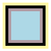
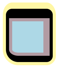
对于下面这个具有 10px 内边距、边框和外边距的 100px 正方形,框值定义了以下形状:
- margin-box:包含所有黄色像素的形状
- border-box:包含所有黑色像素的形状
- padding-box:包含所有淡紫色像素的形状
- content-box:包含所有蓝色像素的形状
同样的定义也适用于一个更复杂的例子,同样是 100px 的正方形,但具有以下边框、内边距和外边距属性:
    border-radius: 20px 20px 20px 40px;
    border-width: 30px 10px 20px 10px;
    padding: 10px 20px 10px 10px;
    margin: 20px 10px 10px 10px;
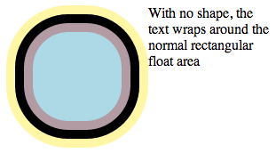
常规浮动环绕与围绕 margin-box 值定义的形状进行环绕之间的区别在于,margin-box 形状包含了圆角塑形。 以一个 100px 的正方形为例,它有 10px 的内边距、边框和外边距,但 border-radius 为 60px。 如果将其设置为左浮动,内容通常会像这样环绕:
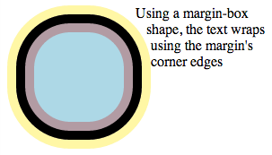
如果为浮动元素添加一个 margin-box 形状,那么内容将围绕圆角的 margin-box 边缘进行环绕。
shape-outside: margin-box;
测试
- shape-outside-border-box-001.html (在线测试) (source)
- shape-outside-border-box-002.html (在线测试) (source)
- shape-outside-border-box-003.html (在线测试) (source)
- shape-outside-border-box-border-radius-001.html (在线测试) (source)
- shape-outside-border-box-border-radius-002.html (在线测试) (source)
- shape-outside-border-box-border-radius-003.html (在线测试) (source)
- shape-outside-border-box-border-radius-004.html (在线测试) (source)
- shape-outside-border-box-border-radius-005.html (在线测试) (source)
- shape-outside-border-box-border-radius-006.html (在线测试) (source)
- shape-outside-border-box-border-radius-007.html (在线测试) (source)
- shape-outside-border-box-border-radius-008.html (在线测试) (source)
- shape-outside-border-box-border-radius-009.html (在线测试) (source)
- shape-outside-border-box-border-radius-010.html (在线测试) (source)
- shape-outside-border-box-border-radius-011.html (在线测试) (source)
- shape-outside-border-box-border-radius-012.html (在线测试) (source)
- shape-outside-box-002.html (在线测试) (source)
- shape-outside-box-003.html (在线测试) (source)
- shape-outside-box-004.html (在线测试) (source)
- shape-outside-box-006.html (在线测试) (source)
- shape-outside-box-007.html (在线测试) (source)
- shape-outside-box-008.html (在线测试) (source)
- shape-outside-box-009.html (在线测试) (source)
- shape-outside-content-box-001.html (在线测试) (source)
- shape-outside-content-box-002.html (在线测试) (source)
- shape-outside-content-box-003.html (在线测试) (source)
- shape-outside-content-box-border-radius-001.html (在线测试) (source)
- shape-outside-content-box-border-radius-002.html (在线测试) (source)
- shape-outside-margin-box-001.html (在线测试) (source)
- shape-outside-margin-box-002.html (在线测试) (source)
- shape-outside-margin-box-border-radius-001.html (在线测试) (source)
- shape-outside-margin-box-border-radius-002.html (在线测试) (source)
- shape-outside-margin-box-border-radius-003.html (在线测试) (source)
- shape-outside-margin-box-border-radius-004.html (在线测试) (source)
- shape-outside-margin-box-border-radius-005.html (在线测试) (source)
- shape-outside-margin-box-border-radius-006.html (在线测试) (source)
- shape-outside-margin-box-border-radius-007.html (在线测试) (source)
- shape-outside-margin-box-border-radius-008.html (在线测试) (source)
- shape-outside-padding-box-001.html (在线测试) (source)
- shape-outside-padding-box-002.html (在线测试) (source)
- shape-outside-padding-box-003.html (在线测试) (source)
- shape-outside-padding-box-border-radius-001.html (在线测试) (source)
- shape-outside-padding-box-border-radius-002.html (在线测试) (source)
- shape-outside-box-000.html (在线测试) (source)
- shape-outside-shape-box-pair-000.html (在线测试) (source)
6. 声明形状
形状通过 shape-outside 属性声明, 并可能由 shape-margin 属性进行修改。 由 shape-outside 和 shape-margin 属性定义的形状 会改变浮动元素的浮动区域的几何形状。
6.1. 浮动区域形状:shape-outside 属性
| 名称: | shape-outside |
|---|---|
| 值: | none | [ <basic-shape> || <shape-box> ] | <image> |
| 初始值: | none |
| 应用于: | 浮动元素和首字下沉框 |
| 继承: | 否 |
| 百分比: | 不适用 |
| 计算值: | 对于 <basic-shape> 按其定义(如果提供了 <shape-box>,则紧随其后);否则为计算后的 <image>;否则为指定的关键字 |
| 规范顺序: | 根据语法 |
| 动画类型: | 对于 <basic-shape> 按其定义,否则为离散 |
该属性的值具有以下含义:
- none
- 浮动区域不受影响。
- <shape-box>
- 如果单独指定这些值中的一个,则形状将基于 margin-box、border-box、padding-box 或 content-box 中的一个进行计算,这些值使用它们各自的框,包括来自 border-radius 的曲率, 类似于 background-clip [CSS3BG]。
- <basic-shape>
- 形状是基于 <basic-shape> 函数之一计算的。如果同时提供了 <shape-box>,它将定义 <basic-shape> 函数的参考框。如果未提供 <shape-box>,则参考框默认为 margin-box。
- <image>
-
形状是根据指定 <image>
的 Alpha 通道
提取和计算的,
由 shape-image-threshold 定义。
用户代理必须对 shape-outside 值中的所有 URL 使用 [FETCH] 规范定义的 CORS 协议。 在获取时, 用户代理必须使用“Anonymous”模式, 将引用源设置为样式表的 URL, 并将源设置为包含文档的 URL。 如果这导致网络错误, 以至于没有有效的备用图像, 其效果等同于指定了 none 值。
测试
- shape-outside-composition.html (在线测试) (source)
- shape-outside-interpolation.html (在线测试) (source)
- inheritance.html (live test) (source)
- shape-outside-computed.html (在线测试) (source)
- shape-outside-invalid-position.html (在线测试) (source)
- shape-outside-valid-position.html (在线测试) (source)
- shape-outside-infinite-crash.html (在线测试) (source)
- shape-outside-invalid-001.html (在线测试) (source)
- shape-outside-invalid-circle-000.html (在线测试) (source)
- shape-outside-invalid-circle-001.html (在线测试) (source)
- shape-outside-invalid-circle-002.html (在线测试) (source)
- shape-outside-invalid-circle-003.html (在线测试) (source)
- shape-outside-invalid-ellipse-001.html (在线测试) (source)
- shape-outside-invalid-ellipse-002.html (在线测试) (source)
- shape-outside-invalid-ellipse-003.html (在线测试) (source)
- shape-outside-invalid-ellipse-004.html (在线测试) (source)
- shape-outside-invalid-ellipse-005.html (在线测试) (source)
- shape-outside-invalid-ellipse-006.html (在线测试) (source)
- shape-outside-invalid-inset-001.html (在线测试) (source)
- shape-outside-invalid-inset-002.html (在线测试) (source)
- shape-outside-invalid-inset-003.html (在线测试) (source)
- shape-outside-invalid-inset-004.html (在线测试) (source)
- float-retry-push-circle.html (在线测试) (source)
- float-retry-push-image.html (在线测试) (source)
- float-retry-push-inset.html (在线测试) (source)
- float-retry-push-polygon.html (在线测试) (source)
- float-should-push.html (在线测试) (source)
- shape-outside-border-box-001.html (在线测试) (source)
- shape-outside-border-box-002.html (在线测试) (source)
- shape-outside-border-box-003.html (在线测试) (source)
- shape-outside-border-box-border-radius-001.html (在线测试) (source)
- shape-outside-border-box-border-radius-002.html (在线测试) (source)
- shape-outside-border-box-border-radius-003.html (在线测试) (source)
- shape-outside-border-box-border-radius-004.html (在线测试) (source)
- shape-outside-border-box-border-radius-005.html (在线测试) (source)
- shape-outside-border-box-border-radius-006.html (在线测试) (source)
- shape-outside-border-box-border-radius-007.html (在线测试) (source)
- shape-outside-border-box-border-radius-008.html (在线测试) (source)
- shape-outside-border-box-border-radius-009.html (在线测试) (source)
- shape-outside-border-box-border-radius-010.html (在线测试) (source)
- shape-outside-border-box-border-radius-011.html (在线测试) (source)
- shape-outside-border-box-border-radius-012.html (在线测试) (source)
- shape-outside-box-002.html (在线测试) (source)
- shape-outside-box-003.html (在线测试) (source)
- shape-outside-box-004.html (在线测试) (source)
- shape-outside-box-006.html (在线测试) (source)
- shape-outside-box-007.html (在线测试) (source)
- shape-outside-box-008.html (在线测试) (source)
- shape-outside-box-009.html (在线测试) (source)
- shape-outside-content-box-001.html (在线测试) (source)
- shape-outside-content-box-002.html (在线测试) (source)
- shape-outside-content-box-003.html (在线测试) (source)
- shape-outside-content-box-border-radius-001.html (在线测试) (source)
- shape-outside-content-box-border-radius-002.html (在线测试) (source)
- shape-outside-margin-box-001.html (在线测试) (source)
- shape-outside-margin-box-002.html (在线测试) (source)
- shape-outside-margin-box-border-radius-001.html (在线测试) (source)
- shape-outside-margin-box-border-radius-002.html (在线测试) (source)
- shape-outside-margin-box-border-radius-003.html (在线测试) (source)
- shape-outside-margin-box-border-radius-004.html (在线测试) (source)
- shape-outside-margin-box-border-radius-005.html (在线测试) (source)
- shape-outside-margin-box-border-radius-006.html (在线测试) (source)
- shape-outside-margin-box-border-radius-007.html (在线测试) (source)
- shape-outside-margin-box-border-radius-008.html (在线测试) (source)
- shape-outside-padding-box-001.html (在线测试) (source)
- shape-outside-padding-box-002.html (在线测试) (source)
- shape-outside-padding-box-003.html (在线测试) (source)
- shape-outside-padding-box-border-radius-001.html (在线测试) (source)
- shape-outside-padding-box-border-radius-002.html (在线测试) (source)
- shape-outside-linear-gradient-001.html (在线测试) (source)
- shape-outside-linear-gradient-002.html (在线测试) (source)
- shape-outside-linear-gradient-003.html (在线测试) (source)
- shape-outside-linear-gradient-004.html (在线测试) (source)
- shape-outside-linear-gradient-005.html (在线测试) (source)
- shape-outside-linear-gradient-006.html (在线测试) (source)
- shape-outside-linear-gradient-007.html (在线测试) (source)
- shape-outside-linear-gradient-008.html (在线测试) (source)
- shape-outside-linear-gradient-009.html (在线测试) (source)
- shape-outside-linear-gradient-010.html (在线测试) (source)
- shape-outside-linear-gradient-011.html (在线测试) (source)
- shape-outside-linear-gradient-012.html (在线测试) (source)
- shape-outside-linear-gradient-013.html (在线测试) (source)
- shape-outside-linear-gradient-014.html (在线测试) (source)
- shape-outside-linear-gradient-015.html (在线测试) (source)
- shape-outside-linear-gradient-016.html (在线测试) (source)
- shape-outside-radial-gradient-001.html (在线测试) (source)
- shape-outside-radial-gradient-002.html (在线测试) (source)
- shape-outside-radial-gradient-003.html (在线测试) (source)
- shape-outside-radial-gradient-004.html (在线测试) (source)
- shape-image-000.html (在线测试) (source)
- shape-image-001.html (在线测试) (source)
- shape-image-002.html (在线测试) (source)
- shape-image-003.html (在线测试) (source)
- shape-image-004.html (在线测试) (source)
- shape-image-005.html (在线测试) (source)
- shape-image-006.html (在线测试) (source)
- shape-image-007.html (在线测试) (source)
- shape-image-008.html (在线测试) (source)
- shape-image-009.html (在线测试) (source)
- shape-image-010.html (在线测试) (source)
- shape-image-011.html (在线测试) (source)
- shape-image-012.html (在线测试) (source)
- shape-image-013.html (在线测试) (source)
- shape-image-014.html (在线测试) (source)
- shape-image-015.html (在线测试) (source)
- shape-image-016.html (在线测试) (source)
- shape-image-017.html (在线测试) (source)
- shape-image-018.html (在线测试) (source)
- shape-image-019.html (在线测试) (source)
- shape-image-020.html (在线测试) (source)
- shape-image-021.html (在线测试) (source)
- shape-image-022.html (在线测试) (source)
- shape-image-023.html (在线测试) (source)
- shape-image-024.html (在线测试) (source)
- shape-image-025.html (在线测试) (source)
- shape-image-026.html (在线测试) (source)
- shape-image-027.html (在线测试) (source)
- shape-image-028.html (在线测试) (source)
- shape-image-029.html (在线测试) (source)
- shape-outside-circle-013.html (在线测试) (source)
- shape-outside-circle-014.html (在线测试) (source)
- shape-outside-circle-015.html (在线测试) (source)
- shape-outside-circle-016.html (在线测试) (source)
- shape-outside-circle-017.html (在线测试) (source)
- shape-outside-circle-018.html (在线测试) (source)
- shape-outside-circle-019.html (在线测试) (source)
- shape-outside-circle-020.html (在线测试) (source)
- shape-outside-circle-021.html (在线测试) (source)
- shape-outside-circle-022.html (在线测试) (source)
- shape-outside-circle-024.html (在线测试) (source)
- shape-outside-circle-025.html (在线测试) (source)
- shape-outside-circle-026.html (在线测试) (source)
- shape-outside-circle-027.html (在线测试) (source)
- shape-outside-circle-028.html (在线测试) (source)
- shape-outside-circle-029.html (在线测试) (source)
- shape-outside-circle-030.html (在线测试) (source)
- shape-outside-circle-031.html (在线测试) (source)
- shape-outside-circle-032.html (在线测试) (source)
- shape-outside-circle-033.html (在线测试) (source)
- shape-outside-circle-034.html (在线测试) (source)
- shape-outside-circle-035.html (在线测试) (source)
- shape-outside-circle-036.html (在线测试) (source)
- shape-outside-circle-037.html (在线测试) (source)
- shape-outside-circle-038.html (在线测试) (source)
- shape-outside-circle-041.html (在线测试) (source)
- shape-outside-circle-042.html (在线测试) (source)
- shape-outside-circle-043.html (在线测试) (source)
- shape-outside-circle-044.html (在线测试) (source)
- shape-outside-circle-047.html (在线测试) (source)
- shape-outside-circle-048.html (在线测试) (source)
- shape-outside-circle-049.html (在线测试) (source)
- shape-outside-circle-050.html (在线测试) (source)
- shape-outside-circle-051.html (在线测试) (source)
- shape-outside-circle-052.html (在线测试) (source)
- shape-outside-circle-053.html (在线测试) (source)
- shape-outside-circle-054.html (在线测试) (source)
- shape-outside-circle-055.html (在线测试) (source)
- shape-outside-circle-056.html (在线测试) (source)
- shape-outside-circle-integer-overflow-crash.html (在线测试) (source)
- shape-outside-ellipse-013.html (在线测试) (source)
- shape-outside-ellipse-014.html (在线测试) (source)
- shape-outside-ellipse-015.html (在线测试) (source)
- shape-outside-ellipse-016.html (在线测试) (source)
- shape-outside-ellipse-017.html (在线测试) (source)
- shape-outside-ellipse-018.html (在线测试) (source)
- shape-outside-ellipse-019.html (在线测试) (source)
- shape-outside-ellipse-020.html (在线测试) (source)
- shape-outside-ellipse-021.html (在线测试) (source)
- shape-outside-ellipse-022.html (在线测试) (source)
- shape-outside-ellipse-023.html (在线测试) (source)
- shape-outside-ellipse-024.html (在线测试) (source)
- shape-outside-ellipse-025.html (在线测试) (source)
- shape-outside-ellipse-030.html (在线测试) (source)
- shape-outside-ellipse-031.html (在线测试) (source)
- shape-outside-ellipse-032.html (在线测试) (source)
- shape-outside-ellipse-033.html (在线测试) (source)
- shape-outside-ellipse-034.html (在线测试) (source)
- shape-outside-ellipse-035.html (在线测试) (source)
- shape-outside-ellipse-036.html (在线测试) (source)
- shape-outside-ellipse-037.html (在线测试) (source)
- shape-outside-ellipse-038.html (在线测试) (source)
- shape-outside-ellipse-039.html (在线测试) (source)
- shape-outside-ellipse-040.html (在线测试) (source)
- shape-outside-ellipse-041.html (在线测试) (source)
- shape-outside-ellipse-042.html (在线测试) (source)
- shape-outside-ellipse-043.html (在线测试) (source)
- shape-outside-ellipse-044.html (在线测试) (source)
- shape-outside-ellipse-045.html (在线测试) (source)
- shape-outside-ellipse-046.html (在线测试) (source)
- shape-outside-ellipse-047.html (在线测试) (source)
- shape-outside-ellipse-048.html (在线测试) (source)
- shape-outside-ellipse-049.html (在线测试) (source)
- shape-outside-ellipse-050.html (在线测试) (source)
- shape-outside-ellipse-051.html (在线测试) (source)
- shape-outside-ellipse-052.html (在线测试) (source)
- shape-outside-ellipse-integer-overflow-crash.html (在线测试) (source)
- shape-outside-inset-010.html (在线测试) (source)
- shape-outside-inset-011.html (在线测试) (source)
- shape-outside-inset-012.html (在线测试) (source)
- shape-outside-inset-013.html (在线测试) (source)
- shape-outside-inset-014.html (在线测试) (source)
- shape-outside-inset-015.html (在线测试) (source)
- shape-outside-inset-016.html (在线测试) (source)
- shape-outside-inset-017.html (在线测试) (source)
- shape-outside-inset-020.html (在线测试) (source)
- shape-outside-inset-021.html (在线测试) (source)
- shape-outside-inset-022.html (在线测试) (source)
- shape-outside-inset-023.html (在线测试) (source)
- shape-outside-inset-024.html (在线测试) (source)
- shape-outside-inset-025.html (在线测试) (source)
- shape-outside-inset-026.html (在线测试) (source)
- shape-outside-inset-027.html (在线测试) (source)
- shape-outside-inset-028.html (在线测试) (source)
- shape-outside-inset-029.html (在线测试) (source)
- shape-outside-inset-030.html (在线测试) (source)
- shape-outside-inset-031.html (在线测试) (source)
- shape-outside-inset-refcrash.html (在线测试) (source)
- shape-outside-polygon-007.html (在线测试) (source)
- shape-outside-polygon-008.html (在线测试) (source)
- shape-outside-polygon-009.html (在线测试) (source)
- shape-outside-polygon-010.html (在线测试) (source)
- shape-outside-polygon-011.html (在线测试) (source)
- shape-outside-polygon-012.html (在线测试) (source)
- shape-outside-polygon-013.html (在线测试) (source)
- shape-outside-polygon-014.html (在线测试) (source)
- shape-outside-polygon-015.html (在线测试) (source)
- shape-outside-polygon-016.html (在线测试) (source)
- shape-outside-polygon-017.html (在线测试) (source)
- shape-outside-polygon-018.html (在线测试) (source)
- shape-outside-polygon-019.html (在线测试) (source)
- shape-outside-polygon-020.html (在线测试) (source)
- shape-outside-polygon-021.html (在线测试) (source)
- shape-outside-polygon-022.html (在线测试) (source)
- shape-outside-polygon-023.html (在线测试) (source)
- shape-outside-polygon-024.html (在线测试) (source)
- shape-outside-polygon-025.html (在线测试) (source)
- shape-outside-polygon-032.html (在线测试) (source)
- shape-outside-polygon-crash.html (在线测试) (source)
- shape-image-threshold-000.html (在线测试) (source)
- shape-image-threshold-001.html (在线测试) (source)
- shape-image-threshold-002.html (在线测试) (source)
- shape-image-threshold-003.html (在线测试) (source)
- shape-margin-000.html (在线测试) (source)
- shape-margin-001.html (在线测试) (source)
- shape-margin-002.html (在线测试) (source)
- shape-margin-003.html (在线测试) (source)
- shape-margin-004.html (在线测试) (source)
- shape-margin-005.html (在线测试) (source)
- shape-outside-box-000.html (在线测试) (source)
- shape-outside-circle-000.html (在线测试) (source)
- shape-outside-circle-001.html (在线测试) (source)
- shape-outside-circle-002.html (在线测试) (source)
- shape-outside-circle-003.html (在线测试) (source)
- shape-outside-circle-004.html (在线测试) (source)
- shape-outside-circle-005.html (在线测试) (source)
- shape-outside-circle-006.html (在线测试) (source)
- shape-outside-circle-007.html (在线测试) (source)
- shape-outside-circle-008.html (在线测试) (source)
- shape-outside-circle-009.html (在线测试) (source)
- shape-outside-circle-010.html (在线测试) (source)
- shape-outside-circle-011.html (在线测试) (source)
- shape-outside-computed-shape-000.html (在线测试) (source)
- shape-outside-computed-shape-001.html (在线测试) (source)
- shape-outside-ellipse-000.html (在线测试) (source)
- shape-outside-ellipse-001.html (在线测试) (source)
- shape-outside-ellipse-002.html (在线测试) (source)
- shape-outside-ellipse-003.html (在线测试) (source)
- shape-outside-ellipse-004.html (在线测试) (source)
- shape-outside-ellipse-005.html (在线测试) (source)
- shape-outside-ellipse-006.html (在线测试) (source)
- shape-outside-ellipse-007.html (在线测试) (source)
- shape-outside-ellipse-008.html (在线测试) (source)
- shape-outside-ellipse-009.html (在线测试) (source)
- shape-outside-ellipse-010.html (在线测试) (source)
- shape-outside-ellipse-011.html (在线测试) (source)
- shape-outside-inset-000.html (在线测试) (source)
- shape-outside-inset-001.html (在线测试) (source)
- shape-outside-inset-0010.html (在线测试) (source)
- shape-outside-inset-002.html (在线测试) (source)
- shape-outside-inset-003.html (在线测试) (source)
- shape-outside-inset-004.html (在线测试) (source)
- shape-outside-inset-005.html (在线测试) (source)
- shape-outside-inset-006.html (在线测试) (source)
- shape-outside-inset-007.html (在线测试) (source)
- shape-outside-inset-008.html (在线测试) (source)
- shape-outside-inset-009.html (在线测试) (source)
- shape-outside-polygon-000.html (在线测试) (source)
- shape-outside-polygon-001.html (在线测试) (source)
- shape-outside-polygon-002.html (在线测试) (source)
- shape-outside-polygon-003.html (在线测试) (source)
- shape-outside-polygon-004.html (在线测试) (source)
- shape-outside-polygon-005.html (在线测试) (source)
- shape-outside-polygon-006.html (在线测试) (source)
- shape-outside-shape-arguments-000.html (在线测试) (source)
- shape-outside-shape-arguments-001.html (在线测试) (source)
- shape-outside-shape-box-pair-000.html (在线测试) (source)
- shape-outside-shape-inherit-000.html (在线测试) (source)
- shape-outside-shape-initial-000.html (在线测试) (source)
- shape-outside-shape-none-000.html (在线测试) (source)
- shape-outside-shape-notation-000.html (在线测试) (source)
- shape-outside-001.html (在线测试) (source)
- shape-outside-002.html (在线测试) (source)
- shape-outside-003.html (在线测试) (source)
- shape-outside-004.html (在线测试) (source)
- shape-outside-005.html (在线测试) (source)
- shape-outside-006.html (在线测试) (source)
- shape-outside-007.html (在线测试) (source)
- shape-outside-008.html (在线测试) (source)
- shape-outside-010.html (在线测试) (source)
- shape-outside-011.html (在线测试) (source)
- shape-outside-012.html (在线测试) (source)
- shape-outside-013.html (在线测试) (source)
- shape-outside-014.html (在线测试) (source)
- shape-outside-015.html (在线测试) (source)
- shape-outside-016.html (在线测试) (source)
- shape-outside-017.html (在线测试) (source)
- shape-outside-018.html (在线测试) (source)
- shape-outside-019.html (在线测试) (source)
6.2. 选择图像像素:shape-image-threshold 属性
shape-image-threshold 定义了用于从图像中提取形状的 Alpha 通道阈值。 值为 0.5 意味着形状将包围所有不透明度超过 50% 的像素。
| 名称: | shape-image-threshold |
|---|---|
| 值: | <opacity-value> |
| 初始值: | 0 |
| 应用于: | 浮动元素 |
| 继承: | 否 |
| 百分比: | 不适用 |
| 计算值: | 指定的数字,被限制在 [0,1] 范围内 |
| 规范顺序: | 根据语法 |
| 动画类型: | 按计算值 |
该属性的值具有以下含义:
- <number>
- 设置用于从图像中提取形状的阈值。 形状由 Alpha 值大于该阈值的像素定义。 超出 0.0(完全透明)到 1.0(完全不透明)范围的阈值将被限制在此范围内。
注意:未来版本的 CSS Shapes 可能会定义一个开关,以使用图像的亮度数据代替 Alpha 数据。 届时,shape-image-threshold 将被扩展,以根据开关状态将其阈值应用于 Alpha 或亮度。
测试
- shape-image-threshold-interpolation.html (在线测试) (source)
- inheritance.html (live test) (source)
- shape-image-threshold-computed.html (在线测试) (source)
- shape-image-threshold-invalid.html (在线测试) (source)
- shape-image-threshold-valid.html (在线测试) (source)
- shape-image-threshold-000.html (在线测试) (source)
- shape-image-threshold-001.html (在线测试) (source)
- shape-image-threshold-002.html (在线测试) (source)
- shape-image-threshold-003.html (在线测试) (source)
6.3. 扩展形状:shape-margin 属性
shape-margin 属性为 shape-outside 添加一个外边距。 这会定义一个新形状,该形状是包含所有从底层形状上的点沿垂直方向向外延伸 shape-margin 距离的点的最小轮廓(在收缩包裹的意义上)。 这包括来自底层形状的任何边缘或线段。 请注意,在无法定义垂线的点(例如尖点或线段末端),则取以该点为中心、半径为 shape-margin 的圆上的所有点。
应用 shape-outside 产生的新形状决定了浮动区域, 并且必须在做出任何环绕决定之前构建。
此属性只接受非负值。
| 名称: | shape-margin |
|---|---|
| 值: | <length-percentage [0,∞]> |
| 初始值: | 0 |
| 应用于: | 浮动元素和首字下沉框 |
| 继承: | 否 |
| 百分比: | 参照包含块的行内尺寸 |
| 计算值: | 计算后的 <length-percentage> 值 |
| 规范顺序: | 根据语法 |
| 动画类型: | 按计算值 |
- <length-percentage [0,∞]>
- 将形状的外边距设置为指定的值。
注意:添加 shape-margin 不允许浮动区域扩展到浮动元素的外边距框之外。 可能需要与 shape-margin 一起应用额外的 margin 以避免裁剪。
shape-margin 从一个多边形的 shape-outside 创建一个偏移。 较浅的蓝色区域显示了一个 100x100px 浮动元素中的形状, 较深的蓝色区域显示了 10px 的偏移。
          .float {
              width: 100px;
              height: 100px;
            shape-outside: polygon(10px 10px, 90px 50px, 40px 50px, 90px 90px, 10px 90px);
            shape-margin: 10px;
          }
如果将 shape-margin 添加到示例 6 的 CSS 标志上, 围绕形状环绕的行框会进一步缩短。 如果图像的 Alpha 通道一直延伸到图像的右边缘, 则应应用一些额外的 margin-right 以确保形状不被外边距框裁剪。
          #CSSlogo {
            shape-margin: 35px;
            margin-right: 35px;
          }
测试
- shape-margin-composition.html (在线测试) (source)
- shape-margin-interpolation.html (在线测试) (source)
- inheritance.html (live test) (source)
- shape-margin-computed.html (在线测试) (source)
- shape-margin-invalid.html (在线测试) (source)
- shape-margin-valid.html (在线测试) (source)
- shape-outside-margin-box-001.html (在线测试) (source)
- shape-outside-margin-box-002.html (在线测试) (source)
- shape-outside-margin-box-border-radius-001.html (在线测试) (source)
- shape-outside-margin-box-border-radius-002.html (在线测试) (source)
- shape-outside-margin-box-border-radius-003.html (在线测试) (source)
- shape-outside-margin-box-border-radius-004.html (在线测试) (source)
- shape-outside-margin-box-border-radius-005.html (在线测试) (source)
- shape-outside-margin-box-border-radius-006.html (在线测试) (source)
- shape-outside-margin-box-border-radius-007.html (在线测试) (source)
- shape-outside-margin-box-border-radius-008.html (在线测试) (source)
- shape-margin-000.html (在线测试) (source)
- shape-margin-001.html (在线测试) (source)
- shape-margin-002.html (在线测试) (source)
- shape-margin-003.html (在线测试) (source)
- shape-margin-004.html (在线测试) (source)
- shape-margin-005.html (在线测试) (source)
7. 隐私考量
关于本规范,尚未提出任何隐私问题。
8. 安全考量
由于 shape-outside 的 <image> 值可以以一种新的方式暴露部分图像数据, 因此其使用仅限于获得 CORS 批准的图像。
致谢
本规范的制定离不开 Tab Atkins Jr.、 Amelia Bellamy-Royds、 Oriol Brufau、 Andrei Bucur、 Alexandru Chiculita、 Boris Chiou、 Emilio Cobos Álvarez、 Elika Etemad、 Arron Eicholz、 Sylvain Galineau、 Daniel Glazman、 Arno Gourdol、 Zoltan Horvath、 Chris Jones、 Bem Jones-Bey、 Ian Kilpatrick、 Guillaume Lebas、 Ting-Yu Lin、 Eric Meyer、 Marcus Mielke、 Alex Mogilevsky、 Hans Muller、 Mihnea Ovidenie、 Virgil Palanciuc、 Noam Rosenthal、 Robert Sanderson、 Dirk Schulze、 Jen Simmons、 Peter Sorotokin、 Bear Travis、 Lea Verou、 Eugene Veselov、 Brad Werth、 Stephen Zilles 以及 CSS 工作组成员的贡献。
变更日志
自 2022 年 11 月 15 日以来
- 添加了 Web 平台测试注解
- 更改了 SVG 形状中 path() 的 fill-rule 默认值
- 阐明了 shape-margin 和浮动区域的交互
- 添加了多边形圆角示例
- 针对 issue #9728,在属性说明中包含了所有基本形状
- 添加了多边形顶点圆角的初步内容
- 针对 issue #8311,使用 opacity-value(值)而非 opacity(属性)作为 shape-image-threshold 的值
- 将 <alpha-value> 替换为 <opacity>
- 针对 issue #5160,阐明了 shape-outside 适用于首字下沉框
- 针对 issue #824,将 ellipse()/circle() 的定义基于 Images 模块的 <radial-size> 重新定义
- 明确了位置默认值可以被其他规范(如 Motion)覆盖。
- 针对 issue #8695,对形状序列化部分进行了针对性修复,并修正了示例
- 针对 issue #9053,修复了 xywh() 的计算值
- 通过 PR #9650,重写了语法,使逗号变为隐式可选
- 通过 PR #9505,清理了 <*-box> 的定义
- 在属性定义中添加了范围表示法
- 针对 issue #9843,为 polygon() 添加了顶点圆角
- 针对 issue #9728,更新了 shape-outside 的说明以包含所有 <basic-shape>
- 针对 issue #2949,阐明了 shape-margin 对浮动区域的贡献
- 根据 issue #3468,为 SVG 形状添加了 fill-rule 默认值处理
- 将 'shape()' 从第 2 级移入
自 2014 年 3 月 20 日以来
- 阐明了 shape-margin 的计算值
- 针对 issue #402,阐明了默认位置值的序列化
- 针对 issue #850,阐明了空的圆形和椭圆形
- 与所有 CSS 模块一样,从属性定义表中删除了“Media:”条目
- 将盒模型引用从 CSS 2 更新为 CSS Box Model 3
- 更新了属性定义表中的“计算值”和“动画类型”
- 针对 issue #4042,阐明了 shape-outside 属性的计算值
- 针对 issue #4102,阐明了 shape-image-threshold 可以接受百分比值,就像任何 alpha 值一样
- 将 path() 从第 2 级移回
- 针对 issue #675,为 margin-box 添加了负外边距处理
- 针对 issue #2301,删除了位置值的特殊情况序列化
- 为 shape-margin 示例添加了说明
- 针对 issue #675,为 margin-box 形状添加了 margin=0 的情况
- 针对 issue #2375,更改了关于退化形状的规则以使用形状边缘
- 针对 issue #392,阐明了无效的路径字符串会使 path() 无效
- 重写了 inset 矩形的定义,添加了 auto 值,并添加了示例
- 阐明了基本形状 rect 函数的计算值
- 各种标记修复,包括使用范围表示法和导出已定义的术语以供其他规范使用
- 将隐私和安全考量分为独立的章节
自 2014 年 2 月 11 日以来
- 在第一个示例中用图像替换了 div
- 在最后一个序列化示例中添加了 0px
自 2013 年 12 月 3 日以来
- 更新了基本形状的计算值和序列化
- 添加了一个 margin-box 示例
- 将 shape-outside 的 auto 更改为 none
- 定义了 shape-box 而不是重新定义 box
- 阐明了来自图像的形状可能会产生多条路径
自 2013 年 6 月 20 日以来
- 添加了“来自框值的形状”一节
- 更新了基本形状的插值
- 允许负的 inset 值,禁止负的半径值
- 将 relevant(相关的)更改为 reference(参考的)
- 移除了 box-sizing 依赖,添加了相关的 box 关键字
- 将 circle() 和 ellipse() 更改为使用径向渐变语法
- 将 rectangle() 推迟到第 2 级
- 阐明了“来自图像的形状”的大小和定位
- 将 inset-rectangle() 更改为 inset()
- 为 shape-image-threshold 预留了未来可能应用于亮度的可能性
- 为 shape-outside 的 URL 添加了 CORS 获取
- 将 shape-outside 的值从 <uri> 更改为 <image>
- 移除了“基于 auto-sizing 的百分比解析为 0”
- 将 shape-image-threshold 的初始值更改为 0.0
- 更改了浮动定位,使其不受 shape-outside 影响
- 浮动元素上的形状被裁剪到浮动元素的外边距框
自 2012 年 5 月 3 日以来
- 将来自 SVG 元素的形状推迟到未来的 Shapes 级别
- 将 shape-inside 推迟到未来的 Shapes 级别
- 将 exclusions 从 shapes 中分离成独立的模块
- 在基本形状中添加了 inset-rectangle()
- 更改了 shape-inside 的溢出图表以显示排除行为
- 更改了 shape-inside,使其对环绕上下文有贡献
- 定义了相对于环绕内容的写入模式的排除边缘
- 统一了 start、end、before 和 after 的使用
- 为基本形状添加了插值
- 更改了基本形状,使其依赖于用 box-sizing 指定的框
- 为 shape-inside 添加了溢出行为。
- 添加了 wrap-flow:minimum。
- 阐明了处理模型。
- 将 wrap-margin 和 wrap-padding 更改为 shape-margin 和 shape-padding。
- 移除了 wrap 简写属性。
自 2011 年 12 月 13 日以来
- 阐明了处理模型。
- 阐明了与浮动的交互。
- 阐明了排除元素会建立一个新的块格式化上下文。