1. 引言
本节非规范性内容。
CSS Multicol 1 § 4 列间隙与分隔线 允许在 多列容器 的列之间绘制分隔线。 本规范扩展了 column-rule-width、column-rule-style 和 column-rule-color 属性,增加了行方向的等价属性,扩展到其他容器布局,并提供高级控制以决定间隙装饰的绘制方式和位置。
1.1. 值的定义
本规范遵循 CSS 属性定义约定(见 [CSS2]), 并使用 值定义语法(见 [CSS-VALUES-3])。 未在本规范中定义的值类型详见 CSS Values & Units [CSS-VALUES-3]。 与其他 CSS 模块的结合可能扩展这些值类型的定义。
除了各自定义处列出的属性特定值外, 本规范定义的所有属性 还接受 CSS 全局关键字 作为属性值。 为了可读性未在此处重复列出。
2. 间隙
CSS 中的多种布局,如 多列容器、弹性盒容器、 网格容器和网格行列容器 会将子元素框彼此并排放置,其间会有 间隙(gap),也称为gutter(槽)。
在本规范中, 间隙(gap)、列间隙(column gap)和 行间隙(row gap) 依容器类型定义如下:
- 多列容器
- 在列方向上, 间隙(列间隙)指每个多列行内相邻列盒之间的槽,见 [CSS-MULTICOL-1]。 在行方向上,间隙(行间隙)指由column-height建立的列盒行之间的 槽,见 [CSS-MULTICOL-2]。
- 弹性盒容器
- 在主轴方向 (如row方向弹性盒 column-gap), 间隙(列间隙)指单个弹性盒行内项目之间的槽。
- 网格容器
- 行间隙和列间隙 分别指槽在网格行 和网格列之间。 详细见CSS Grid Layout 1 § 10.1 槽:row-gap、column-gap 和 gap 属性。
注:如CSS Box Alignment 3 § 8.1 行与列槽:row-gap 与 column-gap 属性所述, 由justify-content 和 align-content 添加的额外空间也计入间隙大小。
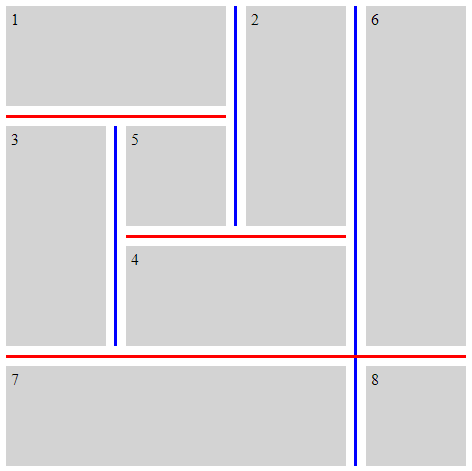
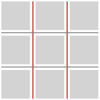
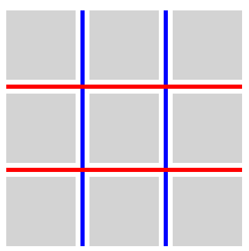
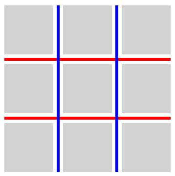
3. 间隙装饰
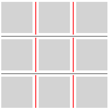
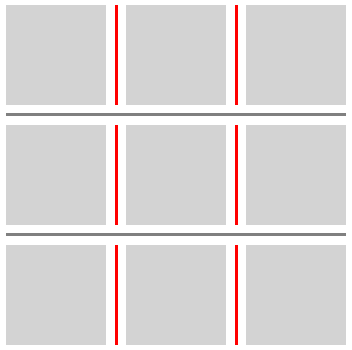
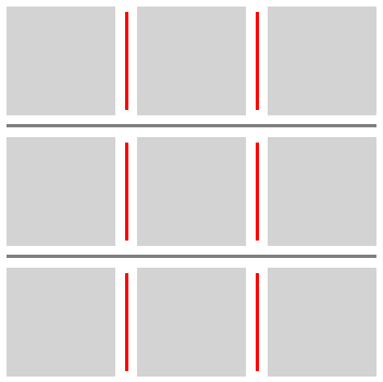
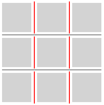
间隙可以包含间隙装饰, 即在相邻盒之间绘制的可见分隔符(如线)
间隙装饰不占用空间。 也就是说,间隙装饰的存在或宽度不会影响其它内容的位置。 如果间隙装饰宽于其所处间隙,相邻盒会覆盖此装饰, 某些情况下装饰甚至可能超出容器边界。
间隙装饰绘制在容器边框正上方。 对可滚动容器而言, 注意容器的边框和背景不会随内容滚动, 但装饰需要与容器内项目一同滚动。
3.1. 几何
3.1.1. 线段端点
线段端点 是间隙中线上的点,间隙装饰线段 可以从该点开始或结束。端点类型有两种:
- 起始线段端点:线段起始点。
- 终止线段端点:线段终止点。
.grid-with-spans {
  display: grid;
  grid-template: repeat(4, 100px) / repeat(4, 100px);
  gap: 20px;
  background: rgb(255 255 128);
}
.grid > * {
  border: 1px dashed black;
}
.flex {
  display: flex;
  flex-wrap: wrap;
  gap: 20px;
  width: 500px;
  background: rgb(255 255 128);
}
.flex > * {
  border: 1px dashed black;
}
.multi-column {
  column-count: 3;
  column-width: 100px;
  column-height: 50px;
  column-wrap: wrap;
  gap: 20px;
  background: rgb(255 255 128);
}

.multi-column > * {
  height: 100px;
  border: 1px dashed black;
}
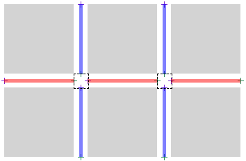
3.1.2. 间隙装饰线段
定义
A gap decoration segment 是通过将一个 start segment endpoint 与一个 end segment endpoint 配对而形成的。 每个 gap 形成一组 gap decoration segments。
在本节中,我们将一个 gap
decoration segment s 表示为
s = [s.start, s.end],
其中 s.start 是该线段的 start segment endpoint,
而 s.end 是该线段的 end segment endpoint。
令 UNION(s1, s2) 等于 [s1.start, s2.end]。
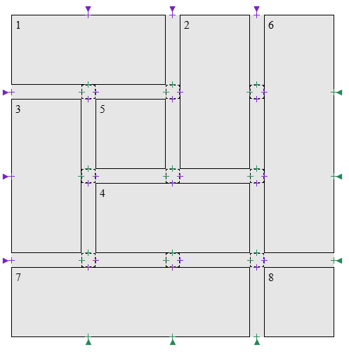
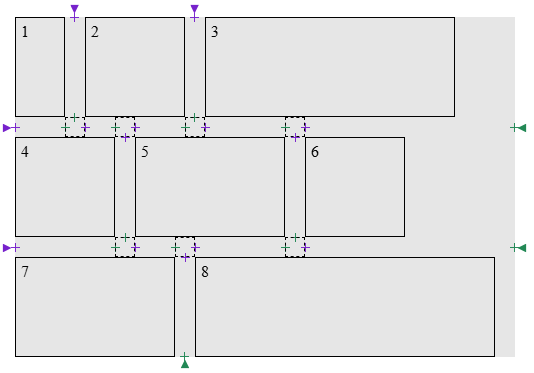
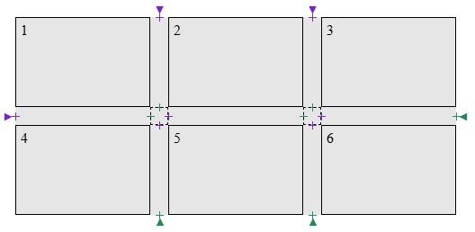
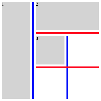
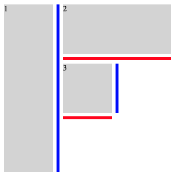
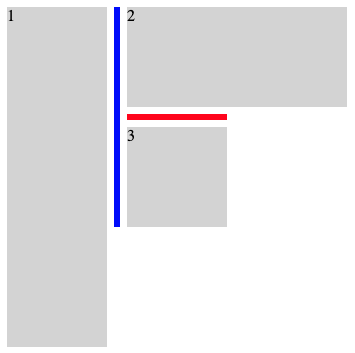
如果对于其端点之间的每个 gap junction, 在间隙两侧存在跨越该连接区所涉及的所有垂直 gaps 的项目, 则一个 gap decoration segment 被称为 被跨跨项目环绕(flanked by spanning items)。
在给定的 gap 的上下文中,一对 segment endpoints a 和 b 被视为 不连续的(discontiguous),如果从 a 到 b 的线段(宽度与该 gap 相同)与容器内的某个子项相交。
算法
- 令 S 为空列表。
-
令 endpoints 为对 G 调用 创建线段端点 的结果,
并按它们沿 G 中线从起点到终点的位置排序。
注: 该列表保证包含偶数个元素,并严格交替出现 start segment endpoint 与 end segment endpoint, 且以一个 start segment endpoint 开始。
- 如果 endpoints 为空,返回 S。
- 令 break 为适用于该间隙的 column-rule-break 或 row-rule-break 的已使用值(以适用者为准)。
-
如果 break 为 none:
- 令 first 为 endpoints 中的第一个项目。
- 令 last 为 endpoints 中的最后一个项目。
- 创建一个 gap decoration segment segment = [first, last]。
- 对 segment 应用偏移,然后将其追加到 S。
- 返回 S。
- 空检查: 如果 endpoints 为空,返回 S。
- 从 endpoints 的前两个项目创建一个 gap decoration segment s。并从列表中移除这两项。
- 如果 s 的端点为 不连续的,则回到 空检查。
-
当 endpoints 非空时:
- 从 endpoints 的前两个项目创建一个 gap decoration segment next,但保留它们在列表中。
- 令 candidate 为 UNION(s, next)。
- 如果 candidate 的端点为 不连续的,退出此循环。
- 如果 break 为 intersection 并且 candidate 不是 被跨跨项目环绕,则退出此循环。
- 从 endpoints 中移除前两个项目。
- 将 s 设为 UNION(s, next)。
- 对 s 应用偏移,然后将其追加到 S。
- 回到 空检查。
- 将 start 按适用的 rule-inset 属性的已使用值偏移。
- 将 end 按适用的 rule-inset 属性的已使用值偏移。
- 用调整后的 [start, end] 更新 s。
测试
- flex-gap-decorations-001.html (live test) (source)
- flex-gap-decorations-006.html (live test) (source)
- flex-gap-decorations-007.html (live test) (source)
- flex-gap-decorations-008.html (live test) (source)
- flex-gap-decorations-015.html (live test) (source)
- flex-gap-decorations-016.html (live test) (source)
- flex-gap-decorations-020.html (live test) (source)
- flex-gap-decorations-021.html (live test) (source)
- flex-gap-decorations-022.html (live test) (source)
- flex-gap-decorations-023.html (live test) (source)
- flex-gap-decorations-024.html (live test) (source)
- flex-gap-decorations-025.html (live test) (source)
- flex-gap-decorations-026-crash.html (live test) (source)
- flex-gap-decorations-027.html (live test) (source)
- flex-gap-decorations-032.html (live test) (source)
- grid-gap-decorations-001.html (live test) (source)
- grid-gap-decorations-029.html (live test) (source)
- grid-gap-decorations-030.html (live test) (source)
- grid-gap-decorations-031.html (live test) (source)
- grid-gap-decorations-032.html (live test) (source)
- grid-gap-decorations-033.html (live test) (source)
- grid-gap-decorations-034.html (live test) (source)
- grid-gap-decorations-035.html (live test) (source)
- grid-gap-decorations-036.html (live test) (source)
- grid-gap-decorations-037.html (live test) (source)
- grid-gap-decorations-041-crash.html (live test) (source)
- grid-gap-decorations-042.html (live test) (source)
- grid-gap-decorations-043-crash.html (live test) (source)
- grid-gap-decorations-044-crash.html (live test) (source)
- grid-gap-decorations-045.html (live test) (source)
- grid-gap-decorations-046.html (live test) (source)
- grid-gap-decorations-047.html (live test) (source)
- subgrid-gap-decorations-001.html (live test) (source)
- subgrid-gap-decorations-002.html (live test) (source)
- subgrid-gap-decorations-003.html (live test) (source)
- subgrid-gap-decorations-009.html (live test) (source)
- subgrid-gap-decorations-010.html (live test) (source)
- subgrid-gap-decorations-011.html (live test) (source)
- subgrid-gap-decorations-012.html (live test) (source)
- subgrid-gap-decorations-013.html (live test) (source)
- subgrid-gap-decorations-014.html (live test) (source)
- subgrid-gap-decorations-015.html (live test) (source)
- subgrid-gap-decorations-016.html (live test) (source)
- subgrid-gap-decorations-018.html (live test) (source)
- multicol-gap-decorations-001.html (live test) (source)
- multicol-gap-decorations-002.html (live test) (source)
- multicol-gap-decorations-003.html (live test) (source)
- multicol-gap-decorations-005.html (live test) (source)
- multicol-gap-decorations-006.html (live test) (source)
- multicol-gap-decorations-007.html (live test) (source)
- multicol-gap-decorations-013.html (live test) (source)
- multicol-gap-decorations-015.html (live test) (source)
- multicol-gap-decorations-016.html (live test) (source)
- multicol-gap-decorations-018.html (live test) (source)
- multicol-gap-decorations-024.html (live test) (source)
3.2. 交叉处断开行为:column-rule-break、row-rule-break 和 rule-break 属性
| 名称: | column-rule-break, row-rule-break |
|---|---|
| 值: | none | normal | intersection |
| 初始值: | normal |
| 适用于: | grid 容器, flex 容器, 多列容器, 以及 grid lanes 容器 |
| 可继承: | no |
| 百分比: | n/a |
| 计算值: | 按指定 |
| 规范顺序: | 与语法一致 |
| 动画类型: | 离散值 |
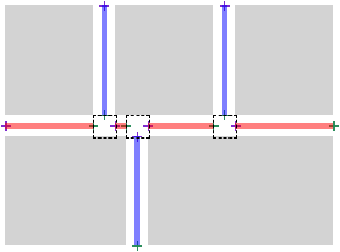
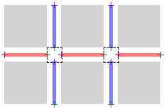
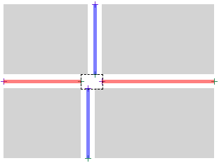
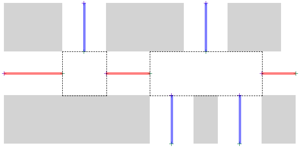
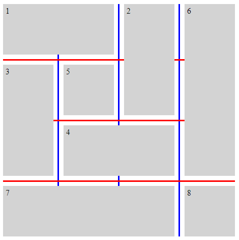
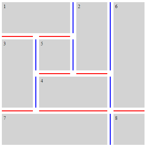
这些属性设置某个间隙内装饰在容器内项目形成的可见“T”形或“十字”交叉点处分割为线段的行为。 如何应用这些值的具体细节,见确定间隙装饰线段的步骤。
- none
- 间隙装饰不会在可见的“T”形或“十字”交叉点处开始或结束。 而是从间隙一端到另一端绘制一个连续的装饰线。
- normal
-
行为依赖于容器类型。
- Grid 容器
- 间隙装饰会在可见的“T”交叉处开始和结束, 但会穿越可见的“十字”交叉点。
- Flex 容器
- 行为与 none 相同。
- 多列容器
- 对 column-rule-break,行为如 intersection。 对 row-rule-break,行为如 none。
- intersection
- 间隙装饰会在可见的“T”形和“十字”交叉点处开始和结束。
测试
- flex-gap-decorations-009.html (在线测试) (源码)
- flex-gap-decorations-010.html (在线测试) (源码)
- flex-gap-decorations-028.html (在线测试) (源码)
- flex-gap-decorations-031.html (在线测试) (源码)
- grid-gap-decorations-006.html (在线测试) (源码)
- grid-gap-decorations-007.html (在线测试) (源码)
- grid-gap-decorations-008.html (在线测试) (源码)
- grid-gap-decorations-009.html (在线测试) (源码)
- grid-gap-decorations-040.html (在线测试) (源码)
- subgrid-gap-decorations-004.html (在线测试) (源码)
- subgrid-gap-decorations-005.html (在线测试) (源码)
- subgrid-gap-decorations-006.html (在线测试) (源码)
- multicol-gap-decorations-014.html (在线测试) (源码)
- multicol-gap-decorations-020.html (在线测试) (源码)
| 名称: | rule-break |
|---|---|
| 值: | <'column-rule-break'> |
| 初始值: | 见各自属性 |
| 适用于: | 与 column-rule-break 和 row-rule-break 相同 |
| 可继承: | 见各自属性 |
| 百分比: | 见各自属性 |
| 计算值: | 见各自属性 |
| 动画类型: | 见各自属性 |
| 规范顺序: | 与语法一致 |
该简写属性会把 column-rule-break 和 row-rule-break 同时设置为相同的值。
测试
下面的示例说明了 *-rule-break 属性的各种设置。
.break-normal-grid {
  display: grid;
  grid-template: repeat(4, 100px) / repeat(4, 100px);
  gap: 20px;
  row-rule: 6px solid red;
  column-rule: 6px solid blue;
  rule-break: normal;
}
.break-none-grid {
  display: grid;
  grid-template: repeat(4, 100px) / repeat(4, 100px);
  gap: 20px;
  row-rule: 6px solid red;
  column-rule: 6px solid blue;
  rule-break: none;
}
.break-intersection-grid {
  display: grid;
  grid-template: repeat(4, 100px) / repeat(4, 100px);
  gap: 20px;
  row-rule: 6px solid red;
  column-rule: 6px solid blue;
  rule-break: intersection;
}
.break-normal-multicol {
  column-width: 150px;
  column-height: 300px;
  gap: 1em;
  row-rule: 4px solid red;
  column-rule: 4px solid blue;
  rule-break: normal;
}
.break-intersection-multicol {
  column-width: 150px;
  column-height: 300px;
  gap: 1em;
  row-rule: 4px solid red;
  column-rule: 4px solid blue;
  rule-break: intersection;
}
.break-normal-flex {
  display: flex;
  flex-wrap: wrap;
  gap: 20px;
  row-rule: 6px solid red;
  column-rule: 6px solid blue;
  rule-break: normal;
}
.break-intersection-flex {
  display: flex;
  flex-wrap: wrap;
  gap: 20px;
  width: 500px;
  gap: 20px;
  row-rule: 6px solid red;
  column-rule: 6px solid blue;
  rule-break: intersection;
}
3.3. 调整间隙装饰端点:rule-inset 属性
| 名称: | column-rule-edge-inset-start, column-rule-edge-inset-end, column-rule-interior-inset-start, column-rule-interior-inset-end, row-rule-edge-inset-start, row-rule-edge-inset-end, row-rule-interior-inset-start, row-rule-interior-inset-end |
|---|---|
| 值: | <length-percentage> |
| 初始值: | 0 |
| 适用于: | grid 容器, flex 容器, 多列容器, 以及 grid lanes 容器 |
| 可继承: | no |
| 百分比: | 参考 交叉间隙宽度 |
| 计算值: | 按指定值 |
| 规范顺序: | 与语法顺序一致 |
| 动画类型: | 按计算值类型 |
这些属性可以用于相对于通常决定装饰开始和结束位置的线段端点,偏移间隙装饰的起始和结束点。
边缘线段端点是指创建于容器内容边缘的线段端点。
百分比值相对于交叉间隙宽度进行计算,定义如下:
- 边缘线段端点
- 交叉间隙宽度为 0。
- 内部线段端点
-
交叉间隙宽度为 间隙连接区在间隙所在同一维度下的尺寸
(行间隙则为水平方向、列间隙则为垂直方向)。
注: 通常为交叉或毗邻间隙上适用的 column-gap 或 row-gap 属性的已用值 。外加因justify-content 或 align-content 添加的额外间距。 但若间隙在重叠区间相交或毗邻时, 交叉间隙宽度由这些区间的并集决定。 见本例。
column-rule-edge-inset-start 和 row-rule-edge-inset-start 属性适用于作为边缘线段端点的start segment endpoints。 column-rule-interior-inset-start 和 row-rule-interior-inset-start 属性适用于作为内部线段端点的 start segment endpoints。 对于这些属性,正值沿间隙轴方向向前偏移,负值向后偏移。
column-rule-edge-inset-end 和 row-rule-edge-inset-end 属性适用于作为边缘线段端点的end segment endpoints。 column-rule-interior-inset-end 和 row-rule-interior-inset-end 属性适用于作为 内部线段端点的 end segment endpoints。 对于这些属性,正值沿间隙轴反方向偏移,负值则向前偏移。
测试
- rule-edge-start-end-inset-computed.html (在线测试) (源码)
- rule-edge-start-end-inset-invalid.html (在线测试) (源码)
- rule-interior-start-end-inset-computed.html (在线测试) (源码)
- rule-interior-start-end-inset-invalid.html (在线测试) (源码)
- flex-gap-decorations-011.html (在线测试) (源码)
- flex-gap-decorations-013.html (在线测试) (源码)
- flex-gap-decorations-014.html (在线测试) (源码)
- flex-gap-decorations-029.html (在线测试) (源码)
- flex-gap-decorations-030.html (在线测试) (源码)
- grid-gap-decorations-010.html (在线测试) (源码)
- grid-gap-decorations-011.html (在线测试) (源码)
- grid-gap-decorations-012.html (在线测试) (源码)
- grid-gap-decorations-013.html (在线测试) (源码)
- grid-gap-decorations-014.html (在线测试) (源码)
- grid-gap-decorations-015.html (在线测试) (源码)
- grid-gap-decorations-038.html (在线测试) (源码)
- grid-gap-decorations-052.html (在线测试) (源码)
- grid-gap-decorations-053.html (在线测试) (源码)
- subgrid-gap-decorations-007.html (在线测试) (源码)
- subgrid-gap-decorations-008.html (在线测试) (源码)
- multicol-gap-decorations-008.html (在线测试) (源码)
- multicol-gap-decorations-009.html (在线测试) (源码)
- multicol-gap-decorations-010.html (在线测试) (源码)
- multicol-gap-decorations-011.html (在线测试) (源码)
- multicol-gap-decorations-012.html (在线测试) (源码)
3.3.1. -start 与 -end 简写
这些简写可以使作者实现统一的不对称装饰。
.inset-start-8px-end-0px {
  column-rule-inset-start: 8px;
  column-rule-inset-end: 0px;
}
| 名称: | column-rule-inset-start, column-rule-inset-end, row-rule-inset-start, row-rule-inset-end |
|---|---|
| 值: | <length-percentage> |
| 初始值: | 见各自属性 |
| 适用于: | 与 column-rule-edge-inset-start、column-rule-interior-inset-start、 column-rule-edge-inset-end、column-rule-interior-inset-end、row-rule-edge-inset-start、row-rule-interior-inset-start、row-rule-edge-inset-end 与 row-rule-interior-inset-end 相同 |
| 可继承: | 见各自属性 |
| 百分比: | 见各自属性 |
| 计算值: | 见各自属性 |
| 动画类型: | 见各自属性 |
| 规范顺序: | 与语法顺序一致 |
这些简写属性会将相应的 -edge- 和 -interior- 属性都设置成相同的值。 例如,column-rule-inset-start 同时设置 column-rule-edge-inset-start 与 column-rule-interior-inset-start 为相同值。
| 名称: | rule-inset-start |
|---|---|
| 值: | <'column-rule-inset-start'> |
| 初始值: | 见各自属性 |
| 适用于: | 与 column-rule-inset-start 和 row-rule-inset-start 相同 |
| 可继承: | 见各自属性 |
| 百分比: | 见各自属性 |
| 计算值: | 见各自属性 |
| 动画类型: | 见各自属性 |
| 规范顺序: | 与语法顺序一致 |
此简写属性会同时设置 column-rule-inset-start 和 row-rule-inset-start 为相同值。
| 名称: | rule-inset-end |
|---|---|
| 值: | <'column-rule-inset-end'> |
| 初始值: | 见各自属性 |
| 适用于: | 与 column-rule-inset-end 和 row-rule-inset-end 相同 |
| 可继承: | 见各自属性 |
| 百分比: | 见各自属性 |
| 计算值: | 见各自属性 |
| 动画类型: | 见各自属性 |
| 规范顺序: | 与语法顺序一致 |
此简写属性会同时设置 column-rule-inset-end 和 row-rule-inset-end 为相同值。
3.3.2. -edge- 与 -interior- 简写
这些简写允许作者在边缘与内部交叉处实现不同的处理效果。
.inset-edge-0px-interior-negative-5px {
  column-rule-edge-inset: 0px;
  column-rule-interior-inset: -5px;
  column-rule-break: intersection;
}
| 名称: | column-rule-edge-inset, column-rule-interior-inset, row-rule-edge-inset, row-rule-interior-inset |
|---|---|
| 值: | <length-percentage> [ <length-percentage> ]? |
| 初始值: | 见各自属性 |
| 适用于: | 与 column-rule-edge-inset-start、column-rule-edge-inset-end、column-rule-interior-inset-start、 column-rule-interior-inset-end、 row-rule-edge-inset-start、 row-rule-edge-inset-end、 row-rule-interior-inset-start 与 row-rule-interior-inset-end 相同 |
| 可继承: | 见各自属性 |
| 百分比: | 见各自属性 |
| 计算值: | 见各自属性 |
| 动画类型: | 见各自属性 |
| 规范顺序: | 与语法顺序一致 |
这些简写会分别设置相应的 -start 和 -end 属性。 例如,column-rule-edge-inset 会同时设置 column-rule-edge-inset-start 与 column-rule-edge-inset-end。 如果只给出一个值,两个属性都设为该值。 如果给出两个值,-start 使用第一个,-end 使用第二个。
| 名称: | rule-edge-inset |
|---|---|
| 值: | <'column-rule-edge-inset'> |
| 初始值: | 见各自属性 |
| 适用于: | 与 column-rule-edge-inset 和 row-rule-edge-inset 相同 |
| 可继承: | 见各自属性 |
| 百分比: | 见各自属性 |
| 计算值: | 见各自属性 |
| 动画类型: | 见各自属性 |
| 规范顺序: | 与语法顺序一致 |
此简写属性会同时设置 column-rule-edge-inset 和 row-rule-edge-inset为相同值。
| 名称: | rule-interior-inset |
|---|---|
| 值: | <'column-rule-interior-inset'> |
| 初始值: | 见各自属性 |
| 适用于: | 与 column-rule-interior-inset 和 row-rule-interior-inset 相同 |
| 可继承: | 见各自属性 |
| 百分比: | 见各自属性 |
| 计算值: | 见各自属性 |
| 动画类型: | 见各自属性 |
| 规范顺序: | 与语法顺序一致 |
此简写属性会同时设置 column-rule-interior-inset 和 row-rule-interior-inset为相同值。
测试
- rule-edge-inset-bidirectional-shorthand.html (在线测试) (源码)
- rule-edge-interior-inset-computed.html (在线测试) (源码)
- rule-edge-interior-inset-invalid.html (在线测试) (源码)
- rule-edge-interior-inset-shorthand.html (在线测试) (源码)
- rule-edge-interior-inset-valid.html (在线测试) (源码)
- rule-interior-inset-bidirectional-shorthand.html (在线测试) (源码)
3.3.3. 通用简写
这些简写允许作者在整个容器内实现统一的处理效果。
.inset-positive-5px {
  column-rule-inset: 5px;
  column-rule-break: intersection;
}
.inset-negative-5px {
  column-rule-inset: -5px;
  column-rule-break: intersection;
}
.inset-negative-50percent {
  column-rule-inset: -50%;
  column-rule-break: intersection;
}
| 名称: | column-rule-inset, row-rule-inset |
|---|---|
| 值: | <'column-rule-edge-inset'> [ / <'column-rule-interior-inset'> ]? |
| 初始值: | 见各自属性 |
| 适用于: | 与 column-rule-edge-inset、column-rule-interior-inset、 row-rule-edge-inset 以及 row-rule-interior-inset 相同 |
| 可继承: | 见各自属性 |
| 百分比: | 见各自属性 |
| 计算值: | 见各自属性 |
| 动画类型: | 见各自属性 |
| 规范顺序: | 与语法顺序一致 |
这些简写设置了对应的边缘和内部的起止值。 值的顺序如下:
edge-start edge-end? [/ interior-start interior-end?]?
省略的值按如下方式补齐:
- 如果内部值省略,则从边缘值复制。
- 任何省略的 end 值由对应 start 值补齐。
| 名称: | rule-inset |
|---|---|
| 值: | <'column-rule-inset'> |
| 初始值: | 见各自属性 |
| 适用于: | 与 column-rule-inset 和 row-rule-inset 相同 |
| 可继承: | 见各自属性 |
| 百分比: | 见各自属性 |
| 计算值: | 见各自属性 |
| 动画类型: | 见各自属性 |
| 规范顺序: | 与语法顺序一致 |
此简写属性会同时设置 column-rule-inset 和 row-rule-inset为相同值。
测试
3.4. 间隙装饰可见性:rule-visibility-items 属性
| 名称: | column-rule-visibility-items, row-rule-visibility-items |
|---|---|
| 值: | all | around | between |
| 初始值: | all |
| 适用于: | grid 容器,以及 多列容器 |
| 可继承: | no |
| 百分比: | n/a |
| 计算值: | 按指定值 |
| 规范顺序: | 与语法一致 |
| 动画类型: | 离散 |
- all
- 无论相邻区域是否有项目,所有间隙线段都绘制装饰。
- around
- 只要相邻的两个区域有一个被项目占据,则该间隙线段绘制装饰。
- between
- 仅当两个相邻区域都被项目占据时,才在该间隙线段绘制装饰。
| 名称: | rule-visibility-items |
|---|---|
| 值: | <'column-rule-visibility-items'> |
| 初始值: | 见各自属性 |
| 适用于: | 与 column-rule-visibility-items 和 row-rule-visibility-items 相同 |
| 可继承: | 见各自属性 |
| 百分比: | 见各自属性 |
| 计算值: | 见各自属性 |
| 动画类型: | 见各自属性 |
| 规范顺序: | 与语法一致 |
该简写属性同时设置 column-rule-visibility-items 和 row-rule-visibility-items 为相同值。
.break-normal-with-all-grid {
  display: grid;
  grid-template: repeat(3, 100px) / repeat(3, 100px);
  gap: 20px;
  row-rule: 6px solid red;
  column-rule: 6px solid blue;
  rule-visibility-items: all;
}
.break-normal-with-around-grid {
  display: grid;
  grid-template: repeat(3, 100px) / repeat(3, 100px);
  gap: 20px;
  row-rule: 6px solid red;
  column-rule: 6px solid blue;
  rule-visibility-items: around;
}
.break-normal-with-between-grid {
  display: grid;
  grid-template: repeat(3, 100px) / repeat(3, 100px);
  gap: 20px;
  row-rule: 6px solid red;
  column-rule: 6px solid blue;
  rule-visibility-items: between;
}
测试
- grid-gap-decorations-054.html (在线测试) (源码)
- grid-gap-decorations-055.html (在线测试) (源码)
- grid-gap-decorations-056.html (在线测试) (源码)
- grid-gap-decorations-057.html (在线测试) (源码)
- grid-gap-decorations-fragmentation-025.html (在线测试) (源码)
- grid-gap-decorations-fragmentation-026.html (在线测试) (源码)
- grid-gap-decorations-fragmentation-027.html (在线测试) (源码)
- subgrid-gap-decorations-019.html (在线测试) (源码)
- subgrid-gap-decorations-020.html (在线测试) (源码)
- subgrid-gap-decorations-021.html (在线测试) (源码)
- subgrid-gap-decorations-022.html (在线测试) (源码)
- subgrid-gap-decorations-023.html (在线测试) (源码)
- subgrid-gap-decorations-024.html (在线测试) (源码)
- subgrid-gap-decorations-025.html (在线测试) (源码)
- rule-visibility-items-computed.html (在线测试) (源码)
- rule-visibility-items-invalid.html (在线测试) (源码)
- rule-visibility-items-shorthand.html (在线测试) (源码)
- rule-visibility-items-valid.html (在线测试) (源码)
3.5. 间隙装饰重叠:rule-overlap 属性
| 名称: | rule-overlap |
|---|---|
| 值: | row-over-column | column-over-row |
| 初始值: | row-over-column |
| 适用对象: | grid 容器、flex 容器,以及 grid lanes 容器 |
| 可继承: | 否 |
| 百分比: | n/a |
| 计算值: | 按指定 |
| 规范顺序: | 与语法一致 |
| 动画类型: | 离散 |
该属性用于设置重叠的间隙装饰的绘制顺序。
- row-over-column
- 行方向装饰绘制在列方向装饰之上。
- column-over-row
- 列方向装饰绘制在行方向装饰之上。
.row-over-column {
  rule-overlap: row-over-column;
  row-rule: 6px solid red;
  column-rule: 6px solid blue;
}
.column-over-row {
  rule-overlap: column-over-row;
  row-rule: 6px solid red;
  column-rule: 6px solid blue;
}
测试
3.6. 分片
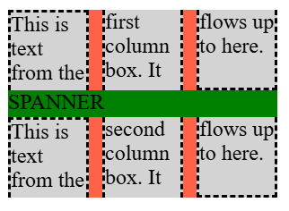
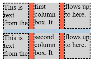
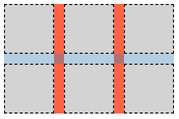
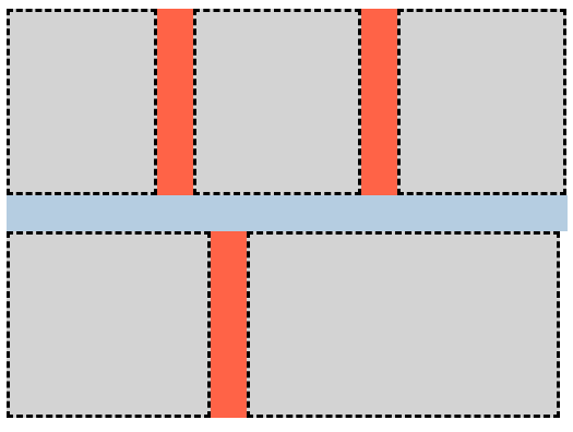
CSS Box Alignment 3 § 8.1 Row and Column Gutters: the row-gap and column-gap properties 指出,当间隙与一个 分片断点 重合时,间隙会消失。 因为在这些位置没有间隙, 因此也不会在其中绘制任何 间隙装饰。
Tests
- flex-gap-decorations-fragmentation-001.html (live test) (source)
- flex-gap-decorations-fragmentation-002.html (live test) (source)
- flex-gap-decorations-fragmentation-003.html (live test) (source)
- flex-gap-decorations-fragmentation-004.html (live test) (source)
- flex-gap-decorations-fragmentation-005.html (live test) (source)
- flex-gap-decorations-fragmentation-006.html (live test) (source)
- flex-gap-decorations-fragmentation-007.html (live test) (source)
- flex-gap-decorations-fragmentation-008.html (live test) (source)
- flex-gap-decorations-fragmentation-009.html (live test) (source)
- flex-gap-decorations-fragmentation-010.html (live test) (source)
- flex-gap-decorations-fragmentation-011.html (live test) (source)
- flex-gap-decorations-fragmentation-012.html (live test) (source)
- flex-gap-decorations-fragmentation-013.html (live test) (source)
- flex-gap-decorations-fragmentation-014.html (live test) (source)
- grid-gap-decorations-fragmentation-001.html (live test) (source)
- grid-gap-decorations-fragmentation-002.html (live test) (source)
- grid-gap-decorations-fragmentation-003.html (live test) (source)
- grid-gap-decorations-fragmentation-004.html (live test) (source)
- grid-gap-decorations-fragmentation-005.html (live test) (source)
- grid-gap-decorations-fragmentation-006.html (live test) (source)
- grid-gap-decorations-fragmentation-007.html (live test) (source)
- grid-gap-decorations-fragmentation-008.html (live test) (source)
- grid-gap-decorations-fragmentation-009.html (live test) (source)
- grid-gap-decorations-fragmentation-010.html (live test) (source)
- grid-gap-decorations-fragmentation-011.html (live test) (source)
- grid-gap-decorations-fragmentation-012.html (live test) (source)
- grid-gap-decorations-fragmentation-013.html (live test) (source)
- grid-gap-decorations-fragmentation-014.html (live test) (source)
- grid-gap-decorations-fragmentation-015.html (live test) (source)
- grid-gap-decorations-fragmentation-016.html (live test) (source)
- grid-gap-decorations-fragmentation-017.html (live test) (source)
- grid-gap-decorations-fragmentation-018-crash.html (live test) (source)
- grid-gap-decorations-fragmentation-019-crash.html (live test) (source)
- grid-gap-decorations-fragmentation-020.html (live test) (source)
- grid-gap-decorations-fragmentation-021.html (live test) (source)
- grid-gap-decorations-fragmentation-022.html (live test) (source)
- grid-gap-decorations-fragmentation-023.html (live test) (source)
- grid-gap-decorations-fragmentation-024.html (live test) (source)
- grid-gap-decorations-fragmentation-025.html (live test) (source)
- grid-gap-decorations-fragmentation-026.html (live test) (source)
- grid-gap-decorations-fragmentation-027.html (live test) (source)
- grid-gap-decorations-fragmentation-028.html (live test) (source)
- subgrid-gap-decorations-fragmentation-001.html (live test) (source)
- subgrid-gap-decorations-fragmentation-002.html (live test) (source)
- subgrid-gap-decorations-fragmentation-003.html (live test) (source)
- subgrid-gap-decorations-fragmentation-004.html (live test) (source)
- subgrid-gap-decorations-fragmentation-005.html (live test) (source)
- subgrid-gap-decorations-fragmentation-006.html (live test) (source)
- subgrid-gap-decorations-fragmentation-007.html (live test) (source)
- subgrid-gap-decorations-fragmentation-008.html (live test) (source)
- subgrid-gap-decorations-fragmentation-009.html (live test) (source)
- subgrid-gap-decorations-fragmentation-010.html (live test) (source)
- subgrid-gap-decorations-fragmentation-011.html (live test) (source)
- subgrid-gap-decorations-fragmentation-012.html (live test) (source)
- subgrid-gap-decorations-fragmentation-013.html (live test) (source)
- subgrid-gap-decorations-fragmentation-014.html (live test) (source)
- subgrid-gap-decorations-fragmentation-015.html (live test) (source)
- subgrid-gap-decorations-fragmentation-016.html (live test) (source)
- subgrid-gap-decorations-fragmentation-017.html (live test) (source)
- subgrid-gap-decorations-fragmentation-018.html (live test) (source)
4. 颜色、样式与宽度
本节中的属性定义取代在 [CSS-MULTICOL-1] 中具有相同名称的属性定义。
4.1. 间隙装饰颜色:column-rule-color, row-rule-color, 和 rule-color 属性
| Name: | column-rule-color, row-rule-color |
|---|---|
| Value: | <line-color-list> | <auto-line-color-list> |
| Initial: | currentcolor |
| Applies to: | grid 容器, flex 容器, 多列容器, 以及 grid lanes 容器 |
| Inherited: | no |
| Percentages: | n/a |
| Computed value: | 按指定 |
| Canonical order: | 与语法一致 |
| Animation type: | 可重复的列表,见 § 4.7 列表值的插值。 |
<line-color-list>          = <line-color-or-repeat>#

<auto-line-color-list>     = <line-color-or-repeat>#? ,
                             <auto-repeat-line-color> ,
                             <line-color-or-repeat>#?

<line-color-or-repeat>     = [ <color> | <repeat-line-color> ]

<repeat-line-color>        = repeat( [ <integer [1,∞]> ] , [ <color> ]# )

<auto-repeat-line-color>   = repeat( auto , [ <color> ]# )
这些属性设置 间隙装饰 的颜色。
| Name: | rule-color |
|---|---|
| Value: | <'column-rule-color'> |
| Initial: | 见各自属性 |
| Applies to: | 与 column-rule-color 和 row-rule-color 相同 |
| Inherited: | no |
| Percentages: | 见各自属性 |
| Computed value: | 见各自属性 |
| Animation type: | 见各自属性 |
| Canonical order: | 与语法一致 |
该简写属性会把 column-rule-color 和 row-rule-color 设置为相同的值。
Tests
- gap-decorations-003.html (live test) (source)
- gap-decorations-004.html (live test) (source)
- gap-decorations-010-crash.html (live test) (source)
- grid-gap-decorations-022.html (live test) (source)
- grid-gap-decorations-024.html (live test) (source)
- grid-gap-decorations-025.html (live test) (source)
- grid-gap-decorations-026.html (live test) (source)
- grid-gap-decorations-027.html (live test) (source)
- grid-gap-decorations-028.html (live test) (source)
- grid-gap-decorations-048.html (live test) (source)
- grid-gap-decorations-049.html (live test) (source)
- grid-gap-decorations-050.html (live test) (source)
- grid-gap-decorations-051.html (live test) (source)
- multicol-gap-decorations-019.html (live test) (source)
- gap-decorations-color-computed.html (live test) (source)
- gap-decorations-color-invalid.html (live test) (source)
- gap-decorations-color-valid.html (live test) (source)
4.2. 间隙装饰样式:The column-rule-style, row-rule-style, and rule-style 属性
| Name: | column-rule-style, row-rule-style |
|---|---|
| Value: | <line-style-list> | <auto-line-style-list> |
| Initial: | none |
| Applies to: | grid 容器, flex 容器, multicol 容器, and grid lanes 容器 |
| Inherited: | no |
| Percentages: | n/a |
| Computed value: | as specified |
| Canonical order: | per grammar |
| Animation type: | discrete |
<line-style-list>          = <line-style-or-repeat>#

<auto-line-style-list>     = <line-style-or-repeat>#? ,
                             <auto-repeat-line-style> ,
                             <line-style-or-repeat>#?

<line-style-or-repeat>     = [ <line-style> | <repeat-line-style> ]

<repeat-line-style>        = repeat( [ <integer [1,∞]> ] , [ <line-style> ]# )

<auto-repeat-line-style>   = repeat( auto , [ <line-style> ]# )
这些属性设置 间隙装饰 的样式。 The <line-style> 值的应用方式与 border-style 相同。
| Name: | rule-style |
|---|---|
| Value: | <'column-rule-style'> |
| Initial: | see individual properties |
| Applies to: | Same as column-rule-style and row-rule-style |
| Inherited: | no |
| Percentages: | see individual properties |
| Computed value: | see individual properties |
| Animation type: | see individual properties |
| Canonical order: | per grammar |
该简写属性会把 column-rule-style 和 row-rule-style 设置为相同的值。
测试
- flex-gap-decorations-002.html (在线测试) (源码)
- flex-gap-decorations-003.html (在线测试) (源码)
- flex-gap-decorations-004.html (在线测试) (源码)
- flex-gap-decorations-005.html (在线测试) (源码)
- flex-gap-decorations-017.html (在线测试) (源码)
- flex-gap-decorations-018.html (在线测试) (源码)
- grid-gap-decorations-002.html (在线测试) (源码)
- grid-gap-decorations-003.html (在线测试) (源码)
- grid-gap-decorations-004.html (在线测试) (源码)
- grid-gap-decorations-005.html (在线测试) (源码)
- grid-gap-decorations-016.html (在线测试) (源码)
- grid-gap-decorations-017.html (在线测试) (源码)
- grid-gap-decorations-020.html (在线测试) (源码)
- grid-gap-decorations-021.html (在线测试) (源码)
- grid-gap-decorations-039.html (在线测试) (源码)
- gap-decorations-style-computed.html (在线测试) (源码)
- gap-decorations-style-invalid.html (在线测试) (源码)
- gap-decorations-style-valid.html (在线测试) (源码)
4.3. 间隙装饰宽度:The column-rule-width, row-rule-width, and rule-width 属性
| Name: | column-rule-width, row-rule-width |
|---|---|
| Value: | <line-width-list> | <auto-line-width-list> |
| Initial: | medium |
| Applies to: | grid 容器, flex 容器, multicol 容器, and grid lanes 容器 |
| Inherited: | no |
| Percentages: | n/a |
| Computed value: | 绝对长度的列表,按边框宽度进行取整 |
| Canonical order: | per grammar |
| Animation type: | repeatable list, see § 4.7 Interpolation of list values. |
<line-width-list>          = <line-width-or-repeat>#

<auto-line-width-list>     = <line-width-or-repeat>#? ,
                             <auto-repeat-line-width> ,
                             <line-width-or-repeat>#?

<line-width-or-repeat>     = [ <line-width> | <repeat-line-width> ]

<repeat-line-width>        = repeat( [ <integer [1,∞]> ] , [ <line-width> ]# )

<auto-repeat-line-width>   = repeat( auto , [ <line-width> ]# )
这些属性设置 间隙装饰 的宽度。 不允许使用负值。
| Name: | rule-width |
|---|---|
| Value: | <'column-rule-width'> |
| Initial: | see individual properties |
| Applies to: | Same as column-rule-width and row-rule-width |
| Inherited: | no |
| Percentages: | see individual properties |
| Computed value: | see individual properties |
| Animation type: | see individual properties |
| Canonical order: | per grammar |
该简写属性会把 column-rule-width 和 row-rule-width 设置为相同的值。
测试
- gap-decorations-009-crash.html (在线测试) (源码)
- grid-gap-decorations-018.html (在线测试) (源码)
- grid-gap-decorations-019.html (在线测试) (源码)
- multicol-gap-decorations-004.html (在线测试) (源码)
- gap-decorations-col-rule-width.html (在线测试) (源码)
- gap-decorations-width-computed.html (在线测试) (源码)
- gap-decorations-width-invalid.html (在线测试) (源码)
- gap-decorations-width-valid.html (在线测试) (源码)
4.4. 间隙装饰简写:column-rule、row-rule 与 rule 属性
| 名称: | column-rule, row-rule |
|---|---|
| 值: | <gap-rule-list> | <gap-auto-rule-list> |
| 初始值: | 见各自属性 |
| 适用于: | 见各自属性 |
| 可继承: | 见各自属性 |
| 百分比: | 见各自属性 |
| 计算值: | 见各自属性 |
| 动画类型: | 见各自属性 |
| 规范顺序: | 与语法一致 |
<gap-rule-list>        = <gap-rule-or-repeat>#

<gap-auto-rule-list>   = <gap-rule-or-repeat>#? ,
                         <gap-auto-repeat-rule> ,
                         <gap-rule-or-repeat>#?

<gap-rule-or-repeat>   = <gap-rule> | <gap-repeat-rule>

<gap-repeat-rule>      = repeat( <integer [1,∞]> , <gap-rule># )

<gap-auto-repeat-rule> = repeat( auto , <gap-rule># )

<gap-rule>             = <line-width> || <line-style> || <color>
这些 简写属性 分别为 column-rule-width、column-rule-style 与 column-rule-color 属性, 或者分别为 row-rule-width、row-rule-style 与 row-rule-color 属性设置值。
| 名称: | rule |
|---|---|
| 值: | <'column-rule'> |
| 初始值: | 见各自属性 |
| 适用于: | 与 column-rule 与 row-rule 相同 |
| 可继承: | no |
| 百分比: | 见各自属性 |
| 计算值: | 见各自属性 |
| 动画类型: | 见各自属性 |
| 规范顺序: | 与语法一致 |
该 简写属性 会把 column-rule 与 row-rule 设为相同的值。
测试
- flex-gap-decorations-019.html (在线测试) (源码)
- gap-decorations-bidirectional-shorthands.html (在线测试) (源码)
- gap-decorations-rule-initial-value-crash.html (在线测试) (源码)
- gap-decorations-rule-shorthand-computed.html (在线测试) (源码)
- gap-decorations-rule-shorthand-invalid.html (在线测试) (源码)
- gap-decorations-rule-shorthand-valid.html (在线测试) (源码)
- gap-decorations-rule-shorthand.html (在线测试) (源码)
4.5. 值列表与 repeat() 表示法
本节中的每个属性都接受以逗号分隔的值列表。 以这种方式设置多个值允许在给定容器内对间隙装饰进行变化。
column-rule-width: 1px;
column-rule-style: solid;
column-rule-color: red, blue;
这样的列表可以包含 repeat() 表示法。 与 CSS Grid Layout 1 § 7.2.3 重复行与列:repeat() 表示法 类似,这些表示法允许将表现出重复模式的一系列间隙装饰以更紧凑的形式书写。
repeat() 语法的通用形式大致为:
repeat( [ <integer [1,∞]> | auto ] , <value># )
repeat() 的第一个参数指定重复次数。
- <integer>
- 指定一个 整数重复器。 一个 整数重复器 会将第二个参数中的值列表展开为按第一个参数指定次数重复的序列。
- auto
- 指定一个 自动重复器。 一个 自动重复器 将用于填充那些 否则不会从列表其他部分获得值的间隙。 在给定的值列表中,最多只能有一个 repeat() 被用作 自动重复器。
repeat() 的第二个参数是一个以逗号分隔的值列表, 该列表中的值是属性(即包含该 repeat() 的属性)所接受的值。
4.6. 将间隙装饰值分配给间隙
间隙装饰在应用 分配 之前,会先应用 间隙折叠。 给定的一组 折叠间隙 恰好消耗一个 间隙装饰;下一个 间隙装饰 会应用到下一个间隙(或下一组 折叠间隙)。 因此,对于装饰目的,折叠间隙 被视为单个 间隙。
- 将 values 中的任何 整数重复器 替换为其展开后的等价项。
-
如果列表不包含任何 自动重复器,则:
- 从 values 的第一个项与 gaps 的第一个项开始, 将每个值分配给对应的间隙。 如果值的数量少于间隙的数量, 则从 values 的第一项重新开始重复, 直到满足需要为止。
- 结束此算法。
- values 包含一个 自动重复器。 令 leading count 为 values 中在 自动重复器 之前的项数。 令 trailing count 为 values 中在 自动重复器 之后的项数。
-
按如下方式对 gaps 进行划分:
- 令 leading gaps 包含 gaps 中的前 leading count 项。
- 令 trailing gaps 包含 gaps 中的最后 trailing count 项, 并排除任何属于 leading gaps 的项。
- 令 auto gaps 包含 gaps 中既不在 leading gaps 也不在 trailing gaps 中的项。
- 如果 leading gaps 非空, 将间隙装饰值分配 给 leading gaps, 使用 values 中的前 leading count 项。
- 如果 trailing gaps 非空, 将间隙装饰值分配 给 trailing gaps, 使用 values 中的前 trailing count 项。
- 如果 auto gaps 非空, 将间隙装饰值分配 给 auto gaps, 使用 自动重复器 的第二个参数中的值列表。
4.7. 列表值的插值
在对 repeat() 值,或 rule-color 或 rule-width 的值列表进行插值时,插值分两步进行:上述值的插值会将“from”和“to”值展开为等长的列表,从而得到:@keyframes example{ from{ column-rule-width : 10 px ; } to{ column-rule-width : 20 px , 40 px ; } }
From:   10px, 10px
At 50%: 15px, 25px
To:     20px, 40px
上述值的插值会将“from”和“to”值展开为等长的列表,从而得到:@keyframes example{ from{ column-rule-width : repeat ( 2 , 5 px , 10 px ); } to{ column-rule-width : repeat ( 2 , 15 px , 20 px ); } }
From:    5px, 10px,  5px, 10px
At 50%: 10px, 15px, 10px, 15px
To:     15px, 20px, 15px, 20px
上述值的插值会将“from”和“to”值展开为等长的列表,从而得到:@keyframes example{ from{ column-rule-width : repeat ( 2 , 10 px , 20 px ); } to{ column-rule-width : 20 px ; } }
From:   10px, 20px, 10px, 20px
At 50%: 15px, 20px, 15px, 20px
To:     20px, 20px, 20px, 20px
上述值的插值会将“from”和“to”值展开为等长的列表,从而得到:@keyframes example{ from{ column-rule-width : repeat ( 2 , 10 px , 20 px ); } to{ column-rule-width : 20 px , 30 px ; } }
From:   10px, 20px, 10px, 20px
At 50%: 15px, 25px, 15px, 25px
To:     20px, 30px, 20px, 30px
当我们要在其间插值的任一列表(from 与 to)包含一个 自动重复器 时:
- 将 from 和 to 各自分割为若干段,方式与我们在 分配间隙装饰值 时的分割类似:
- 如果只有 from 或 to 中的一个包含自动重复器,则退回到 离散 插值。
- 展开每个段中的任何整数重复器。
- 如果 from 中 leading values 的长度与 to 中 leading values 的长度不匹配,则退回到 离散 插值。 如果 from 中 trailing values 的长度与 to 中 trailing values 的长度不匹配,则同样退回到 离散 插值。
- 当 from 与 to 都包含自动重复器,且其段的长度按上述方式匹配时, 对每个 auto values 中的值列表应用 可重复列表 插值算法。
across from 与 to 的 leading values 与 trailing values 长度匹配, 因此我们可以对每个段应用 可重复列表 算法。@keyframes example{ from{ column-rule-width : 10 px , repeat ( auto, 20 px ), 30 px } to{ column-rule-width : 20 px , repeat ( auto, 40 px ), 40 px } }
From:   10px, repeat(auto, 20px), 30px
At 50%: 15px, repeat(auto, 30px), 35px
To:     20px, repeat(auto, 40px), 40px
across from 与 to 的 leading values 与 trailing values 长度匹配, 因此我们可以对每个段应用 可重复列表 算法。@keyframes example{ from{ column-rule-width : 10 px , 20 px , repeat ( auto, 20 px ), 30 px } to{ column-rule-width : 20 px , 30 px , repeat ( auto, 40 px , 50 px ), 40 px } }
From:   10px, 20px, repeat(auto, 20px, 20px), 30px
At 50%: 15px, 25px, repeat(auto, 30px, 35px), 35px
To:     20px, 30px, repeat(auto, 40px, 50px), 40px
from 的 leading values 与 to 的 leading values 长度不匹配, 因此我们退回到 离散 插值。@keyframes example{ from{ column-rule-width : 10 px , repeat ( auto, 20 px ) } to{ column-rule-width : 20 px , 30 px , repeat ( auto, 40 px , 50 px ) } }
from 的 trailing values 与 to 的 trailing values 长度不匹配, 因此我们退回到 离散 插值。@keyframes example{ from{ column-rule-width : 10 px , repeat ( auto, 20 px ), 30 px } to{ column-rule-width : 20 px , repeat ( auto, 40 px ), 40 px , 50 px } }
Tests
- column-rule-inset-interpolation.html (live test) (source)
- gap-decorations-color-neutral-keyframe-001.html (live test) (source)
- gap-decorations-color-neutral-keyframe-002.html (live test) (source)
- gap-decorations-color-neutral-keyframe-003.html (live test) (source)
- gap-decorations-color-neutral-keyframe-004.html (live test) (source)
- gap-decorations-color-neutral-keyframe-005.html (live test) (source)
- gap-decorations-inset-neutral-keyframe-001.html (live test) (source)
- gap-decorations-inset-neutral-keyframe-002.html (live test) (source)
- gap-decorations-width-neutral-keyframe-001.html (live test) (source)
- gap-decorations-width-neutral-keyframe-002.html (live test) (source)
- gap-decorations-width-neutral-keyframe-003.html (live test) (source)
- gap-decorations-width-neutral-keyframe-004.html (live test) (source)
- gap-decorations-width-neutral-keyframe-005.html (live test) (source)
- row-rule-color-interpolation.html (live test) (source)
- row-rule-inset-interpolation.html (live test) (source)
- row-rule-width-interpolation.html (live test) (source)
- rule-color-interpolation-conversion-001.html (live test) (source)
- rule-color-interpolation-conversion-002.html (live test) (source)
- rule-color-interpolation-conversion-crash.html (live test) (source)
- rule-color-interpolation-multiple-values-001.html (live test) (source)
- rule-color-interpolation-repeaters-001.html (live test) (source)
- rule-width-interpolation-conversion-001.html (live test) (source)
- rule-width-interpolation-conversion-002.html (live test) (source)
- rule-width-interpolation-multiple-values-001.html (live test) (source)
- rule-width-interpolation-multiple-values-002.html (live test) (source)
- rule-width-interpolation-repeaters.html (live test) (source)
4.8. 序列化
仅当组件长属性是 重复器对齐 时,column-rule、row-rule 和 rule 简写才会从对应的长属性序列化出来。 如果长属性不是 重复器对齐,则该简写的序列化结果为空字符串。
column-rule: 1px solid red, 2px dashed green, 3px dotted blue;
拆分得到如下长属性值:
column-rule-width: 1px, 2px, 3px;
column-rule-style: solid, dashed, dotted;
column-rule-color: red, green, blue;
由于长属性是 重复器对齐(三者均有相同的项数(3),且每项都是单个值), 它们会被序列化回相同的原始简写值。
如果直接指定这三个长属性(而不是来自简写),也会产生相同的行为。
column-rule: 1px solid red, repeat(2, 2px dashed green);
拆分得到如下长属性值:
column-rule-width: 1px, repeat(2, 2px);
column-rule-style: solid, repeat(2, dashed);
column-rule-color: red, repeat(2, green);
由于长属性是 重复器对齐(三者均有相同的项数(2),且在每个索引处项类型匹配——索引 0 为单值,索引 1 为整数重复器;整数重复器的重复计数相同且包含相同数量的值), 它们会被序列化回相同的原始简写值。
如果直接指定这三个长属性(而不是来自简写),也会产生相同的行为。
column-rule: repeat(auto, 1px solid red, 2px dashed green);
拆分得到如下长属性值:
column-rule-width: repeat(auto, 1px, 2px);
column-rule-style: repeat(auto, solid, dashed);
column-rule-color: repeat(auto, red, green);
由于长属性是 重复器对齐(三者均有相同的项数(1),每项是自动重复器,且自动重复器包含相同数量的值(2)), 它们会被序列化回相同的原始简写值。
如果直接指定这三个长属性(而不是来自简写),也会产生相同的行为。
column-rule: repeat(auto, 1px solid red, 2px dashed green);
column-rule-width: repeat(auto, 3px, 4px, 5px);
拆分得到如下长属性值:
column-rule-width: repeat(auto, 3px, 4px, 5px);
column-rule-style: repeat(auto, solid, dashed);
column-rule-color: repeat(auto, red, green);
由于长属性不是 重复器对齐(自动重复器包含不同数量的值),column-rule 简写将在序列化时输出为空字符串。
如果直接指定这三个长属性(而不是来自简写),也会产生相同的行为。
column-rule: repeat(2, 1px solid red, 2px dashed green);
column-rule-style: dashed, dotted, solid;
拆分得到如下长属性值:
column-rule-width: repeat(2, 1px, 2px);
column-rule-style: dashed, dotted, solid;
column-rule-color: repeat(2, red, green);
由于长属性不是 重复器对齐(在索引 0 处项的类型不匹配——宽度与颜色为整数重复器,而样式为单值),column-rule 简写将在序列化时输出为空字符串。
如果直接指定这三个长属性(而不是来自简写),也会产生相同的行为。
column-rule: repeat(2, 1px solid red, 2px dashed green);
column-rule-color: repeat(4, red, cyan);
拆分得到如下长属性值:
column-rule-width: repeat(2, 1px, 2px);
column-rule-style: repeat(2, solid, dashed);
column-rule-color: repeat(4, red, cyan);
由于长属性不是 重复器对齐(整数重复器的重复计数不同),column-rule 简写将在序列化时输出为空字符串。
如果直接指定这三个长属性(而不是来自简写),也会产生相同的行为。
Tests
5. 致谢
本规范得以实现要归功于许多人的贡献和反馈,包括: Ahmad Shadeed, Alison Maher, Benoît Rouleau, Elika Etemad, Ian Kilpatrick, Javier Contreras Tenorio, Josh Tumath, Kurt Catti-Schmidt, Lea Verou, Oliver Williams, Rachel Andrew, Sam Davis Omekara Jr., Sebastian Zartner, Tab Atkins-Bittner, and the CSS Working Group members. 特别感谢 Mats Palmgren 起草了间隙装饰的初步提案。
6. 隐私注意事项
本规范尚未报告新的隐私注意事项。
7. 安全注意事项
本规范尚未报告新的安全注意事项。
8. 更改
8.1. 自 17 April 2025 Working Draft 以来的更改
- 规定了当间隙因轨道折叠而重合时的行为。 (Issue 11814)
- 将 rule-paint-order 重命名为 rule-overlap。 (Issue 12540)
- 更新了交点的定义以使用 gutter。 (Issue 12084)
- 更新了尾随间隙装饰的分配,改为使用正向顺序的值。 (Issue 12527)
- 规定了可能包含重复器的值的插值行为。 (Issue 12431)
- 移除了当 column-rule-width 在 column-rule-style 为 none 或 时计算值为 0 的特殊情况。 (Issue 11494)
- 将 rule-outset 属性更改为 rule-inset 并引入了相关属性。 (Issue 12603, Issue 12848, Issue 8402)
- 将 inset 属性的初始值更新为 0 并移除了 auto 关键字。 (Issue 13137)
- 新增段落澄清:当间隙因片段断点被抑制时,不绘制间隙装饰。 (Issue 11520)
- 更新了当间隙因轨道折叠而重合时的行为。 (Issue 11814)
- 新增了从单独长属性序列化简写的章节。 (Issue 12201)
- 将颜色、宽度和样式长属性更新为使用逗号分隔列表,取代空格分隔列表。 (Issue 12201)
- 新增了关于空网格区域旁边的间隙装饰的章节。 (Issue 12602)
- 澄清对齐空间计入间隙大小。 (Issue 12922)
- 将 break 值 spanning-item 重命名为 normal。 (Issue 13127)
- 刷新示例以反映规范的更改。
- 添加了指向 WPT 测试套件的链接。
- 添加了致谢章节。